Why Arial Narrow Became the Brat Font: The Typography Behind the Album Cover
There is no custom typeface on the Brat album cover. The lowercase, slightly blurred lettering that defined an entire cultural moment in 2024 is built on Arial Narrow — one of the most ordinary fonts installed on almost every computer in the world. Here is why that choice worked, and how the effect was actually put together.
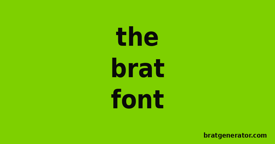
What Font Is Used on the Brat Album Cover?
The base typeface is Arial Narrow Regular, originally designed by Patricia Saunders and Robin Nicholas and published by Monotype. It is a condensed companion to standard Arial and ships as a system font on most Windows and many other computers — meaning almost nobody chooses it on purpose for a design project. That is exactly the point.
How the Brat Text Effect Was Created
The cover treatment takes plain lowercase Arial Narrow text and applies three simple changes:
- Horizontal stretching — the letterforms are widened by roughly 90%, giving them a slightly squashed, off-kilter look.
- Tight, optical kerning — letters sit close together rather than at their default spacing.
- A soft blur — a light blur filter is applied over the text, softening the edges and giving it a low-resolution, almost accidental feel.
None of those steps require custom lettering, a type foundry, or specialist software — which is exactly why the look became so easy for fans, brands, and other artists to copy within days of the album’s announcement.
Who Designed the Brat Cover?
The cover was designed by Brent David Freaney at Special Offer Inc., working under the creative direction of Charli XCX’s longtime collaborator Imogene Strauss. Their choice to treat a default system font as though it belonged on a prestige album cover deliberately inverted the usual rules of album art, where polish and originality are normally the whole point.
Why an “Ugly” Font Worked So Well
Arial is, by design, invisible — the typeface of internal memos, undesigned spreadsheets, and placeholder text nobody is meant to notice. Putting it at the center of a major pop rollout was a statement in itself: unpolished, unbothered, and confident enough not to need a custom typeface to stand out. That attitude lines up directly with the “brat” persona the album is built around.
Recreate the Brat Font Yourself
You do not need Arial Narrow installed or any design software to get the same look. Our Brat Font Generator and Brat Text Generator apply the same stretched, high-contrast treatment to any text you type, so you can drop it straight into a caption, cover, or sticker.
The Brat Font: Frequently Asked Questions
What font is the Brat album cover?
The Brat album cover uses Arial Narrow Regular, a standard system font, stretched horizontally and set in lowercase with a soft blur applied.
Is the Brat font a custom typeface?
No. It is a treated version of Arial Narrow, a common default font, rather than a custom-designed typeface.
Who designed the Brat font treatment?
The cover was designed by Brent David Freaney at Special Offer Inc., with art direction from Imogene Strauss.
Can I recreate the Brat font online for free?
Yes, tools like the Brat Font Generator and Brat Text Generator apply the same stretched, blurred lowercase treatment to any text you enter.
Try the Brat Font Yourself
Type any word or phrase and get the same stretched, lowercase Brat look in seconds.
Try the Brat Font Generator