What Font Is the Brat Look? Identification, Alternatives and Licensing
People ask what font the brat look uses, and the honest answer has three parts: what the look is made of, which common typefaces come closest, and what you are allowed to do with them. This page answers the identification question. For recreating the look step by step, see the settings guide; for the difference between generator types, see the text vs font generator explainer.
What defines the look
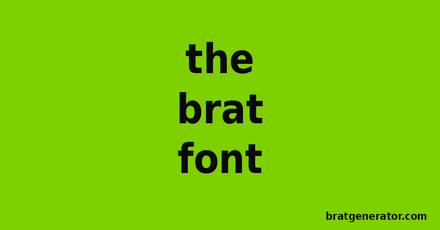
The style is a bold, condensed-looking, lowercase sans-serif set in large size on a flat color. Designers who discuss the cover commonly describe it as close to an Arial-style typeface, with the blur and low-quality treatment adding to the effect. Exact identification is difficult because the final artwork is a processed image, not live type, and because opinions differ. Treat any single named font as an approximation.
Closest common typefaces
| Typeface | Why it is close | Availability |
|---|---|---|
| Arial Bold | Neutral, wide-use sans-serif; this is what the free generator uses | Installed on most systems |
| Arial Narrow Bold | Condensed version, closer to a tall, tight look | Installed on many systems |
| Helvetica Bold | Similar neutral grotesque | Common on Apple devices |
| Liberation Sans or Arimo | Metric-compatible with Arial | Free and open licensed |
Because fonts differ by system, your result will vary slightly.
Licensing
System fonts such as Arial are licensed for use in documents and images, and generating a text image is a normal use. Redistributing a font file or embedding it in a product is different and depends on the license. If you are making a commercial product, read the license or choose an open-licensed alternative.
Try it
The Brat Text Generator uses Arial bold with adjustable size and blur, which gets you the characteristic look without installing anything. The Font Generator page explains the options.
Choosing weight, case and spacing
Heavy weights stay readable when the image is shrunk. Lowercase gives a casual, direct feel. Tighter spacing looks denser and louder, while wider spacing looks calmer. Try one change at a time on the same word and compare the results side by side.
A short experiment
Generate the same word at three sizes, then view them at the smallest size they will appear. The one you can still read at a glance is the right size. This test takes two minutes and often beats debating the style.
Licensing reminder
The generator draws text as an image. If you install any font for documents, check its licence for personal, commercial and web use.
Practical type tests
Test your headline on a white background and on the green, at large and small sizes. Choose the version that stays readable in all four tests.
Combining with body text
Use the headline for impact and a plain typeface for explanations.
Identifying a font from an image yourself
If you want to check a font in any image, use a font identification tool: upload a clear image with straight text, crop to a few letters and compare the suggestions. Results are approximate, and processed images are harder to match. Compare the shapes of the letters a, g, and t, which differ most between sans-serif fonts.
| Letter | What to look for |
|---|---|
| a | Single or double story |
| g | Single or double story, tail shape |
| t | Slanted or straight top |
| r | Terminal shape |
Why the font matters less than the treatment
The look comes from scale, color and blur as much as from the typeface. Two different bold sans-serif fonts at the same size on the same color read as nearly the same style.
Licensing in short
| Use | Usually fine | Check the license |
|---|---|---|
| Printing a poster | Yes | |
| Posting an image | Yes | |
| Embedding in an app or website | Yes | |
| Selling the font file | No |
Checking legibility
Style choices should serve readability. After generating text, view it at the smallest size it will appear and make sure each word can be read in a second. If not, increase the size or reduce the number of words.
Quick guide to type choices
| Choice | Effect |
|---|---|
| Lowercase | Casual and direct |
| Bold weight | Strong and readable at small sizes |
| Wide spacing | Calm and airy |
| Tight spacing | Dense and loud |
What the tool actually produces
The generator draws your text onto a coloured canvas using a bold sans-serif style and exports it as an image. It does not produce a font file you can install, which is worth knowing when you plan how to use the result.
Settings that change readability
| Setting | Effect | Tip |
|---|---|---|
| Font size | Fills the frame | Larger for short words |
| Blur | Softens edges | Keep low for text |
| Quality | File size and sharpness | Use a high value |
| Colours | Contrast | Black on green reads best |
Using the result well
If you need editable text, keep your original wording in a note. If you need to print large, export the biggest preset and check sharpness on a proof. If you need to use the text on a website, add alt text describing the image.
Licensing in practice
If you install any separate font file for documents, read its licence for personal, commercial and web use before you rely on it.
Troubleshooting export problems
If the exported image looks blurry, check that you chose a large preset and a high quality setting. If the text is cut off, reduce the font size or shorten the text. If the file is too large to upload, export a JPEG at a lower quality or choose a smaller preset, and keep a PNG master for later.
Frequently asked questions
Is there one official font?
There is no public, confirmed answer, so use the closest options above.
Is Arial free?
It comes with most operating systems, but it is licensed, not open. Use Arimo or Liberation Sans if you need an open license.
Which fonts are free for commercial use?
Open-licensed fonts such as those under the SIL Open Font License; read each license.
Does the generator install fonts?
No, it only draws text in an image.
Does the tool use a real font file?
The tool renders bold Arial-style text onto an image, and you can export the result as PNG or JPEG.
Brat Generator is an independent tool and is not affiliated with, endorsed by, or sponsored by Charli XCX, her record label, or any related brand. Any album or trademark names are mentioned only to describe a visual style.