How to Make a Brat-Style YouTube Thumbnail (Exact Size and Design Guide)
If your video needs to stand out in a crowded recommendation feed, a Brat-style YouTube thumbnail is a strong starting point. The look is simple: a flat, high-energy color, bold lowercase text, and enough empty space for the idea to read instantly. That simplicity is useful because YouTube thumbnails are often viewed very small on phones, search pages, and suggested-video panels.
This guide explains the correct canvas, how much text to use, where to place it, and how to create the graphic in a few minutes with the Brat Generator. You can also reuse the design system for channel banners, Shorts, and social posts.
What is a Brat-style YouTube thumbnail?
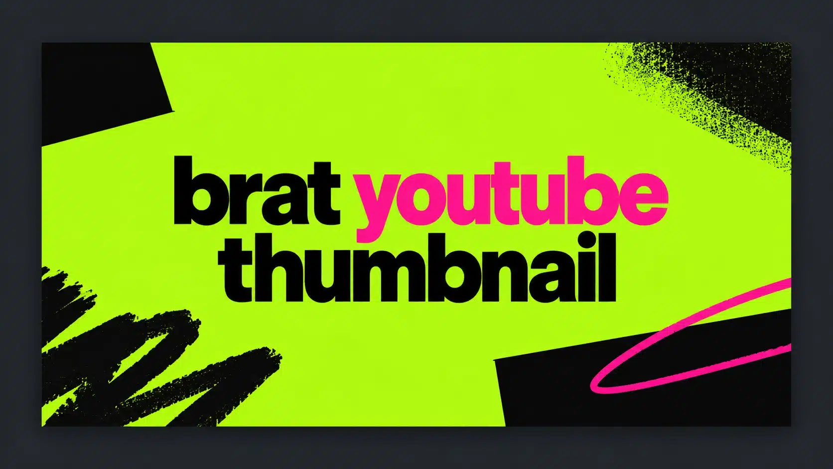
A Brat-style thumbnail is a video thumbnail inspired by the stripped-back visual language associated with the Brat era: a saturated flat background, bold typography, sharp contrast, and a deliberately unpolished feel. It is not a copy of official album artwork. It is a fan-made design direction that adapts the same ideas to a video’s topic.
The format works especially well for music commentary, fashion videos, reaction content, pop-culture explainers, memes, playlists, and creator updates. The goal is not to cram the entire title into the image. The title and thumbnail should work together: the title explains the promise, while the thumbnail creates recognition and curiosity.
The correct YouTube thumbnail size
For a standard YouTube video, use a 16:9 canvas. YouTube currently recommends uploading the largest practical image, with guidance pointing to 3840 × 2160 pixels for videos and a minimum width of 640 pixels. A 1280 × 720 export is still a practical working size for many creators, and it preserves the correct ratio.
For a Short, use a vertical 9:16 design instead. YouTube’s current help documentation recommends 2160 × 3840 for Shorts, with a minimum height of 640 pixels. Do not force a 16:9 thumbnail into a vertical Short layout: the crop can remove the main word or make the design feel unbalanced. See the official YouTube thumbnail guidance before publishing if the platform’s upload rules change.
Best Brat thumbnail dimensions at a glance
| Use case | Recommended canvas | Ratio |
|---|---|---|
| Standard YouTube video | 1280 × 720 or 3840 × 2160 | 16:9 |
| YouTube Short | 1080 × 1920 or 2160 × 3840 | 9:16 |
| YouTube channel banner | 2560 × 1440 | 16:9 |
When you use the Brat Generator, choose a YouTube thumbnail preset if it is available, or enter a custom 1280 × 720 canvas. The tool runs in the browser, so you can type, preview, and export without creating an account.
How to make a Brat YouTube thumbnail
1. Start with the video promise
Before choosing a color, write down the one thing a viewer should understand. Examples include “new album reaction,” “outfit formulas,” “summer playlist,” or “how the trend started.” Turn that idea into one to four strong words. Short copy gives the design room to breathe and remains readable when the thumbnail is reduced.
Avoid repeating the complete video title. If the title says “I Tried the Brat Aesthetic for Seven Days,” the thumbnail could say “seven days” or “brat test.” The combination is clearer and more intriguing than placing the entire sentence on the image.
2. Choose a flat background
Classic Brat Green is commonly represented by the hex value #8ACE00, but you do not have to use green every time. Black, white, hot pink, cyan, yellow, purple, and gold can all work when the contrast is strong. Pick one background color and keep the design mostly flat. A single field is part of the visual identity and compresses cleanly on the web.
Use black or white text depending on which one is easier to read. Do not choose a color merely because it looks interesting at full size. Shrink the preview to phone size and check whether the word is still obvious in less than a second.
3. Keep text away from interface overlays
YouTube can place duration information and other interface elements near the bottom-right corner. Keep important words, faces, and symbols away from that area. A centered composition is the safest option, while left-aligned text can work if the subject of the video occupies the opposite side.
Leave a generous margin around the canvas. The thumbnail may appear in different containers across devices, and edge-to-edge text can feel cramped or become vulnerable to cropping.
4. Use typography as the main visual
The Brat look depends on text doing the visual work. Use a clean, bold, lowercase treatment and adjust the size until the phrase has presence without touching the edges. A short word can be very large. A longer phrase needs more breathing room or a line break.
Try three layout variations: centered, left aligned, and stacked. Keep the background unchanged so you are testing hierarchy rather than decorating. If the message is still obvious when you blur your eyes or view the image as a small thumbnail, the layout is doing its job.
5. Add one supporting detail, if necessary
A simple thumbnail does not need a collage. If the topic needs context, add one supporting element: a small arrow, a cropped object, a single reaction shape, or a subtle scribble. Keep it secondary. Too many stickers, gradients, icons, and words work against the flat, immediate quality that makes this aesthetic effective.
Brat thumbnail ideas for different channels
For music creators, use a track title, a mood word, or a short reaction such as “obsessed” or “first listen.” For fashion creators, use a single style promise such as “green looks,” “club fit,” or “seven outfits.” For commentary channels, pair an expressive word with a simple visual cue. Meme pages can use the punchline itself, but keep it short enough to read at a glance.
For a faceless channel, bold text and a recognizable color system can become a repeatable brand. Keep the same two or three colors across uploads and vary only the phrase. Consistency helps returning viewers identify your videos before they read the channel name.
How to export a small, sharp file
Flat-color graphics are naturally efficient, but export still matters. Use the largest useful canvas, remove unnecessary texture, and choose a modern compressed format when your workflow supports it. For a website article about thumbnails, a WebP feature image under 1 MB is ideal; for YouTube itself, follow YouTube’s current accepted upload formats and file-size rules.
Name your working file descriptively, such as brat-youtube-thumbnail-guide.webp, rather than final-final-2.png. Add descriptive alt text when you publish the tutorial: “Brat-style YouTube thumbnail with lime-green background and bold black text.” Alt text should describe the image, not repeat a keyword unnaturally.
Common mistakes to avoid
The most common mistake is treating the thumbnail like a poster. A poster can contain details that viewers inspect. A thumbnail must communicate while the viewer is scrolling. Long sentences, low contrast, tiny decorative text, and important information in the bottom-right corner all reduce clarity.
Another mistake is making every upload visually identical. A consistent palette is helpful, but the phrase still needs to reflect the actual video. A thumbnail that looks stylish but creates the wrong expectation may earn a click and lose watch time. Make the design attractive, then make the promise accurate.
Final checklist
Before uploading, confirm that the image uses a 16:9 canvas for a standard video, the main phrase is readable on a phone, the contrast is strong, the subject is not hidden by interface overlays, and the thumbnail supports rather than duplicates the title. Test two or three versions when possible. YouTube’s own testing tools can help compare thumbnails for eligible videos, and its guidance emphasizes clear, simple designs that work across devices.
Ready to create one? Open the free Brat Generator, choose a YouTube-sized canvas, type a short phrase, select a high-contrast color pair, and export your thumbnail.
FAQ
What size should a Brat YouTube thumbnail be?
Use a 16:9 canvas. 1280 × 720 is a convenient working size, while YouTube’s current guidance recommends larger 3840 × 2160 images where practical.
Can I use a Brat thumbnail for a YouTube Short?
Yes, but use a vertical 9:16 canvas. A standard 16:9 thumbnail can crop poorly on Short surfaces.
Should the text be uppercase or lowercase?
Lowercase usually feels closer to the Brat-inspired look, but readability matters more than strict imitation. Choose the treatment that remains clear at small size.
Is the Brat Generator affiliated with Charli XCX?
No. It is an independent fan tool inspired by a visual trend and is not endorsed by Charli XCX, Atlantic Records, or any label.
Frequently asked questions
What size is a YouTube thumbnail?
1280 by 720 pixels at 16:9 is the commonly recommended size; confirm with YouTube’s current guidance.
How much text should a thumbnail have?
Three words or fewer usually reads best at small sizes.
Where should I place text?
Avoid the bottom-right corner, where the video duration label often appears.
Brat Generator is an independent tool and is not affiliated with, endorsed by, or sponsored by Charli XCX, her record label, or any related brand. Any album or trademark names are mentioned only to describe a visual style.