Brat Book Cover Design: How to Create a Bold Typographic Cover Concept
A Brat-inspired book cover design uses restraint as its main visual tool. Instead of filling the cover with characters, scenery, or decorative elements, it makes one phrase carry the mood. A saturated color field and large typography can look striking on a bookstore shelf, a social post, or an ebook thumbnail, but only when the title remains readable and the cover communicates the book’s genre.
This guide explains how to create a bold typographic book-cover concept, choose a format, position the title, handle print and ebook versions, and use the Brat Generator to explore text-led directions. It is useful for writers, self-publishers, zine makers, designers, and readers experimenting with fan-inspired visual concepts.
What makes a Brat-style book cover?
A Brat-style cover is a design direction rather than an official template. It often uses a flat bright background, lowercase or bold typography, high contrast, and one or two imperfect marks. The approach can work for essays, poetry, cultural criticism, journals, fiction, and experimental projects. It is less suitable when the genre requires a detailed character, a scenic promise, or a specific visual world that cannot be reduced to type.
The key is adaptation. Use original title treatment, original colors, and original marks. Do not copy official album art, logos, or protected campaign assets. If the cover is for a fan project, label it honestly and avoid suggesting that the work is official.
Start with the genre and reader
A cover is a sales signal. Before choosing green, write three words that describe the book’s genre and emotional promise. A memoir may need intimacy. A poetry collection may need space. A satire may support a loud color and a blunt phrase. A business book may need a cleaner structure even if it uses a bold palette.
The Brat-inspired look can be expressive, but it should not mislead. A neon typographic cover can make a serious book feel playful, while a black-and-white version can make the same title feel more literary. Choose the mood deliberately.
Cover dimensions and formats
Print books require a front cover, back cover, and spine when the project is a wraparound jacket or paperback cover. The exact final dimensions depend on trim size, page count, paper, and printer. An ebook cover is usually a single portrait rectangle and must remain readable as a small thumbnail.
Create the front-cover concept first, then expand it into a full print layout. Keep the title and author name inside safe margins. If you add bleed for professional printing, follow the printer’s specifications rather than guessing.
How to create the typographic concept
1. Make the title the first decision
Write the book title exactly as it should appear. Try lowercase, title case, and a stacked arrangement. A short title can become a large central word. A longer title may need three lines, a smaller size, or a short subtitle. Do not make the title so small that it feels like a label.
2. Choose a background and text pair
Classic Brat Green is often represented by #8ACE00, but book covers can use black, white, pink, blue, yellow, purple, cyan, or gold. Begin with one background and one text color. Black on bright green is direct. White on black is dramatic. White on a bright background may require a darker backing shape for readability.
Use the Brat Generator to create quick square or custom text studies. The goal is not to finish the entire wraparound cover in the generator. The goal is to test how the title behaves at different sizes and alignments.
3. Establish a clear hierarchy
The book title is usually the largest element. The author name can be smaller but still readable. A subtitle, series name, or edition marker should remain secondary. Use spacing to create hierarchy before adding lines, boxes, or icons.
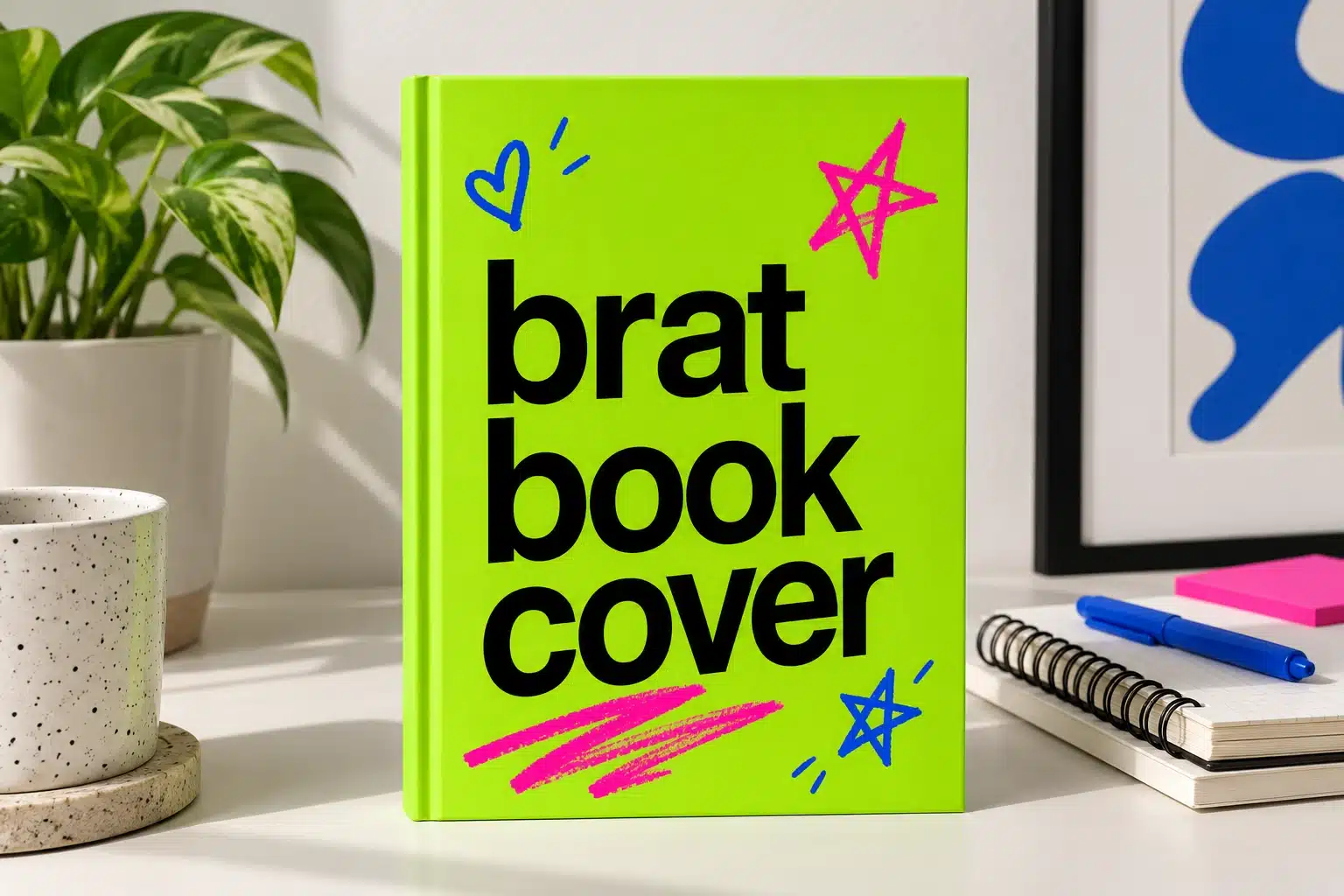
For a simple cover, place the title in the center and reserve a quiet area for the author name. For a more editorial cover, align the title to one edge and use a small accent mark on the opposite side. Whichever layout you choose, preview it as a tiny thumbnail.
4. Add one expressive detail
A scribble, star, underline, hand-drawn shape, or small object can keep the design from feeling generic. Use it as a signature rather than decoration everywhere. If the book is part of a series, repeat the same mark across covers while changing the background color and title.
Print cover considerations
Print has physical constraints that a screen does not. Thin lines can disappear, bright colors may shift, and text too close to the trim edge can be cut. Keep the title inside a safe margin and test a physical proof. If you are designing a spine, check that the title remains readable at the actual width.
The back cover needs a different hierarchy. Use the same color system but leave room for the description, barcode, publisher mark, or review quotes. A front cover can be almost empty; a back cover usually cannot. Keep the front and back related without forcing the same text size everywhere.
Ebook and thumbnail versions
An ebook cover is often viewed at a small size in a list. Remove details that disappear when reduced and make the title the strongest element. Test the cover at a thumbnail size next to competing covers. A flat field and bold type can perform well, but only if the title is distinctive and the genre remains clear.
Create a separate social version if needed. A square quote graphic or vertical announcement can use the same color and title treatment, but do not simply crop the book cover if the title becomes awkward. Link to the site’s Brat text generator for square cover-style experiments, and to the Brat text generator for longer promotional phrases.
Accessibility and readable type
Use strong contrast and sufficient type size. Avoid relying on a subtle blur to create style if it makes the title fuzzy. Check the cover under reduced brightness and on a small phone. If the book title contains unusual punctuation or a long subtitle, make sure the text remains legible for readers who cannot zoom.
For a web article about the design, use alt text such as “lime-green Brat-inspired book cover with bold black lowercase title and blue and pink hand-drawn accents.” Repeat the title and design explanation as normal page text so users do not have to depend on the image.
Common mistakes
Do not make the cover a direct replica of official artwork. Do not use a color that reduces the title’s contrast. Do not put all the book’s selling points on the front. Do not create one square file and stretch it across a full paperback wrap. Do not forget the spine and back-cover margin. Finally, do not let the aesthetic overpower the genre promise.
Final checklist
Know the genre, write a clear title, choose two core colors, test lowercase and stacked layouts, preview at thumbnail size, keep print margins safe, create separate ebook and social versions, add descriptive image metadata, and assemble the final cover in a format appropriate to the printer or publisher. Start with the free Brat Generator for fast typographic exploration.
Frequently asked questions
What is a Brat-style book cover?
It is an original typographic cover direction using flat saturated color, bold lettering, high contrast, and minimal expressive accents.
Can I make a book cover with the Brat Generator?
You can use it to explore the title graphic and color direction. Assemble the final print wraparound or ebook file in a publishing or design tool.
What color is Brat Green?
The commonly used reference value is #8ACE00, but you can choose another color if it better suits the book’s genre and readability.
Should the author name be large?
It should be readable and appropriately prominent, but the title normally carries the first visual emphasis unless the author has an established brand.
Brat Generator is an independent tool and is not affiliated with, endorsed by, or sponsored by Charli XCX, her record label, or any related brand. Any album or trademark names are mentioned only to describe a visual style.