How to Recreate the Brat Text Look in Any Editor: Settings, Spacing and Blur
You do not need a special tool to recreate the look: any editor with a text layer, a color fill and a blur setting can do it. This page is a settings guide with specific values. For font identification, see what font the look uses.
The recipe
| Setting | Starting value | Why |
|---|---|---|
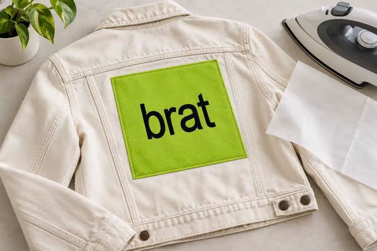
| Background | #8ACE00 | Flat acid-style green |
| Text color | #000000 | Maximum contrast |
| Font | Arial Bold or a similar sans-serif | Neutral, heavy strokes |
| Case | lowercase | Part of the look |
| Size | Fill 70 to 80 percent of the width | Large and simple |
| Letter spacing | Default or slightly tight | Tight spacing feels heavy |
| Blur | 1 to 3 px | Softens edges slightly |
| Quality | Slightly reduced on export | Adds a low-fi feel; keep above 60 percent |
Steps in a typical editor
- Create a square canvas, for example 1080 x 1080 px.
- Fill the background with #8ACE00.
- Add a text layer in lowercase, set to bold.
- Scale the text so it fills most of the width.
- Apply a Gaussian blur of a pixel or two to the text layer only.
- Export as JPEG at moderate quality if you want the lo-fi effect, or PNG for crisp output.
Do it faster
The Brat Text Generator does all of this with sliders. Font size runs from 20 to 400, blur from 0 to 10 and quality from 60 to 100, and there are ten size presets.
Common mistakes
- Too much blur makes the text illegible; stay below about 4 px.
- Using a thin font ruins the weight.
- Adding shadows or outlines breaks the flat look.
Accessibility
Black on lime is high contrast. If you change the colors, check them against the colors guide.
Practising with real examples
Take three phrases of different lengths and generate each at the same size. Notice how longer phrases need smaller type to fit, and how short words can run large. Choosing the right phrase length is half of a readable design.
Checking contrast
Test each phrase on the default green and on a white background. Black on green stays readable, while white on green does not. Comparing them side by side shows why contrast matters more than any font setting.
Building your own rules
Write down the size and colour combination you prefer, so every new design starts from a tested setup.
Keeping a style log
Write down the size, colours and word for every design that performed well. After a month you will have a personal guide built from real results.
Worked example: matching the look in a free editor
Open any free online editor and create a 1080 by 1080 canvas. Fill it with #8ACE00. Add a text layer with the word “hello” in a bold sans-serif font. Increase the size until the word spans about three quarters of the width. Turn the text color to #000000. Add a one-pixel blur to the text layer. Export as JPEG at about 80 percent quality. That gives you something very close to the generator output without any special tool.
Troubleshooting
| Problem | Fix |
|---|---|
| Text looks thin | Switch to the bold weight or a heavier font |
| Edges look jagged | Export at a larger size or use PNG |
| Colors look off | Check that the file uses the RGB color profile |
| Blur makes text unreadable | Reduce it to 1 px |
Variation without losing the look
Change one thing at a time: the background color, the word or the layout. If you change all three, it no longer reads as the same style. The colors guide lists alternative pairs.
Keeping settings consistent
Write down your values in a note: hex codes, font, size ratio and blur. Reusing the same numbers keeps a series cohesive.
Reading the style choices
The visual style depends on a few choices: weight, case, size, contrast and spacing. If you change only one at a time, you can see which one affects readability the most. Try the same word in two sizes and two colour combinations and compare.
Practice exercise
- Type a three-word phrase.
- Export it at two different sizes.
- View both at thumbnail size.
- Choose the one that reads best.
Explaining the choices behind a style
Every design choice has a reason: size controls readability, colour controls contrast and weight controls emphasis. If you cannot explain why you chose something, try removing it.
Three-step method
- Choose the size that fills the frame.
- Choose the colour pair with strong contrast.
- Check the result at the smallest size it will be seen.
Reading examples
Take three pieces of graphic work you like and write down what you notice: size, colour, spacing and alignment. Then try to recreate one with your own words. You will learn more from this than from a long list of rules.
Keeping a style file
Save your best outputs in a folder with notes about settings so you can reuse them.
From practice to routine
Once you know your preferred settings, make a template note and keep it with your content calendar. Update it only when you have evidence that a change improves readability or engagement.
Common beginner mistakes
Typing too much text, choosing low-contrast colours and exporting at a small size are the most common mistakes. Fix them one at a time and you will see quick improvements.
Frequently asked questions
People often ask whether more decoration means better design. For text graphics the opposite is usually true: fewer effects, higher contrast and a larger size nearly always read better. Treat every setting as something to justify. If you cannot say what a change improves, leave it out.
Why is it lowercase?
It is part of the recognizable look, but you can use any case.
Can I use a different font?
Yes; any bold sans-serif works.
Do I need exact numbers?
No; they are a starting point.
What if I do not have Arial?
Use any bold sans-serif such as Helvetica, Arimo or Liberation Sans.
Which choice matters most?
Contrast and size usually matter more than anything else for readability.
Brat Generator is an independent tool and is not affiliated with, endorsed by, or sponsored by Charli XCX, her record label, or any related brand. Any album or trademark names are mentioned only to describe a visual style.