How to Add Brat-Style Text to a Photo
How to Add Brat-Style Text to a Photo
You can add Brat-style text to a photo by creating the text as a separate graphic, placing it over a simple image area, and adjusting its size and contrast until it stays readable. The best result keeps the message short, uses bold lowercase lettering, and gives the photo enough breathing room.
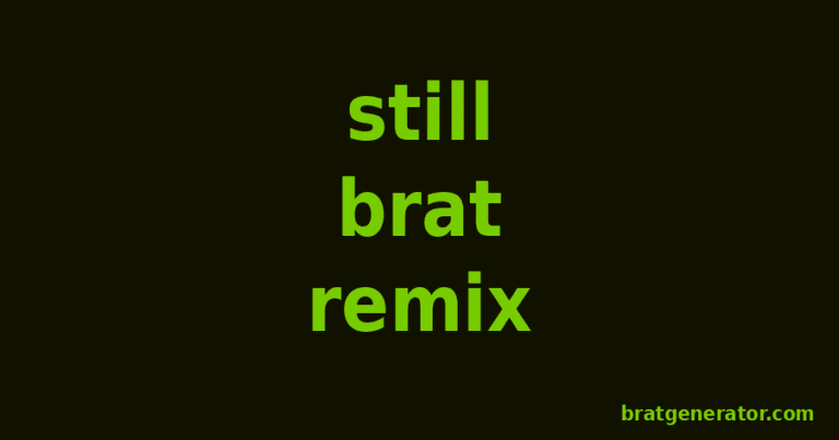
This method works for profile posts, story graphics, playlist covers, event announcements, and personal edits. You do not need an advanced design program. Start with the free Brat text generator, export your text, and combine it with your photo in any editor that supports layers.
Start with the message, not the effect
Choose the exact words before editing the photo. A short phrase is easier to read and feels more intentional than a full sentence.
Aim for one to five words. Examples include “weekend mode,” “late again,” “green room,” or a name and date. These examples are original phrases, not lyrics or official campaign language.
Long copy forces the type to shrink. Small type loses impact on a phone screen, especially when the photo contains faces, clothing, signs, or other competing details.
Write the phrase in lowercase if you want the most recognizable visual rhythm. Lowercase letters create an informal, direct tone. Capital letters can work, but they often feel more like a conventional poster.
Pick a photo with usable empty space
The easiest photo has one clear subject and one quiet area for text. A plain wall, open sky, blurred background, floor, or dark shadow can provide that space.
Avoid placing text across eyes or other important facial features. The words should support the photo rather than hide its main subject.
Check the crop before designing. A vertical image suits Stories and Reels covers, while a square image works well for a feed post or playlist tile. Our TikTok image and video size guide explains the common vertical format and safe placement considerations.
If the picture is busy everywhere, create a small solid rectangle behind the text. Another option is to darken or blur only the text area. Do not blur the entire image unless that is part of the intended look.
Create the Brat-style text layer
Open the generator and enter your chosen phrase. Keep the first version simple so you can judge the shape of the words before adding other elements.
Export the text with a transparent background when your editing workflow supports it. A transparent file lets the original photo remain visible around every letter. Follow the transparent-background guide if you need help choosing and using that format.
If transparency is not available in your current setup, export the text on a solid background that matches the intended design. You can use the solid block as a deliberate label rather than trying to hide it.
Do not stretch the exported text unevenly. Resize it from a corner or use a locked aspect ratio so the letter shapes stay consistent.
Place the words where they can be read
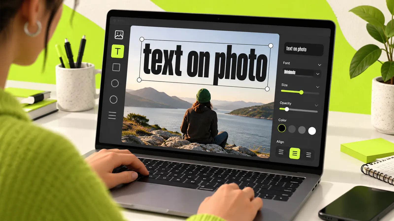
Add the exported text as a new layer above the photo. Begin near the visual center, then test the upper and lower thirds.
The center creates a strong poster effect. The upper third often works when the subject is lower in the frame. The lower third can resemble a caption card, but it must remain clear of app buttons and interface overlays.
Leave a safe margin around the edges. A practical starting point is about 8% of the canvas width on the left and right. This space reduces accidental cropping and prevents the design from feeling cramped.
Use alignment intentionally. Centered text feels bold and balanced. Left-aligned text can feel more editorial. Avoid a nearly centered placement because it may look accidental.
Build contrast without losing the photo
Readable text needs a clear lightness difference from its background. Dark text works best over a light area, while light text works best over a dark area.
Zoom out until the image is about the size it will appear in a social feed. If you cannot read the phrase immediately, increase the contrast or move it to a calmer part of the image.
A subtle shadow may help on a mixed background, but keep it restrained. A large glow or heavy outline can overpower the direct, minimal style.
A solid green text block can also create separation. Use a color that is inspired by the aesthetic without claiming it is an official brand color. Screens and export settings can display the same color differently.
Choose a size for the final screen
Design for the smallest likely viewing size. A phone preview is more useful than a full-screen desktop preview.
The main phrase should usually occupy a noticeable portion of the width. If it uses less than one quarter of the canvas, it may become secondary to the photo. That can be appropriate for a subtle label, but not for a headline.
Test two versions: one where the phrase spans roughly half the width and another where it spans about three quarters. Compare them at thumbnail size. Keep the version that communicates fastest.
Use line breaks only when they clarify meaning. Break a phrase at a natural pause, not simply where the software runs out of space.
Adjust the photo instead of forcing the text
Small photo adjustments can make the overlay look integrated. Reduce saturation slightly if many colors compete with the words. Lower highlights behind light text or lift shadows behind dark text.
Do not apply extreme edits just to imitate a trend. The subject should still look intentional and recognizable.
You can add a light grain or a slight softness for texture. Check the image at full size after applying either effect because excessive grain can make letters look rough after compression.
If the photograph contains a person, avoid edits that change their identity or imply an endorsement. Use photos you own or have permission to edit.
Prepare a vertical social version
For a Story-style layout, use a 9:16 canvas and keep important words away from the top and bottom interface areas. Place the subject and headline within the central safe region.
Our Brat Instagram Story guide covers the broader Story workflow. For a photo overlay, the key difference is that the photograph remains the primary layer and the generated text becomes the focal label.
Preview the image on a phone before exporting. Check whether account names, reply fields, and navigation controls could cover the phrase.
Export a clean final file
Export as PNG when sharp text and transparency matter. Export as high-quality JPG when the image is a full photograph and a smaller file is more important.
For most social uses, sRGB is the safest color space. It reduces unexpected color shifts across browsers and common phone apps.
Keep a layered working file before producing the final image. The editable version lets you reposition the text for square, portrait, and vertical crops without rebuilding the design.
Give the file a descriptive name, such as green-room-photo-text-vertical.png. A clear name is easier to find and provides better context than a camera filename.
Check accessibility before sharing
Good accessibility begins with legibility. Use sufficient contrast, avoid very small lettering, and do not rely on color alone to communicate meaning.
Add alternative text when the publishing platform provides an alt-text field. Describe the important subject, the visible words, and the purpose of the graphic. A useful example is: “Portrait against a pale wall with the words weekend mode in bold green text.”
Do not fill alt text with keywords. It should help a person understand the image when they cannot see it.
If the graphic contains essential event details, repeat those details in the surrounding post caption. Text inside an image may not be accessible to every reader or search system.
Common problems and quick fixes
The text disappears into the background
Move it to a quieter area or add a restrained solid panel behind it. Increasing size alone will not fix poor contrast.
The image looks crowded
Shorten the phrase, remove decorative elements, or choose a crop with more empty space. One strong message usually works better than several competing labels.
The text looks stretched
Undo the resize and lock the layer proportions. Scale from a corner rather than dragging only one side.
The export looks blurry
Build the canvas at the final required dimensions and avoid enlarging a small export. PNG often keeps generated lettering sharper than a heavily compressed JPG.
The design looks like a copy
Use your own photo, original wording, and a distinct composition. The goal is to make a personal graphic inspired by a visual approach, not reproduce official artwork.
A five-minute workflow
Use this sequence when you need a fast result:
- Choose an original phrase of five words or fewer.
- Select a photo with one quiet area.
- Generate and export the text layer.
- Place the text without covering the main subject.
- Check contrast at phone size.
- Export the correct crop and add useful alt text.
This short workflow covers the decisions that most affect quality. Extra filters cannot rescue a weak message, an unreadable placement, or an unsuitable photo.
Make your photo version
Start with a clear photo and one short message. Generate the text, position it where the image is calm, and test the result at phone size before exporting.
The strongest design is not the one with the most effects. It is the one a viewer understands in a second.
Frequently asked questions
Can I put Brat-style text directly on any photo?
You can place it on a photo you own or have permission to use. Choose an area with enough contrast and avoid covering the main subject.
Should the text be green?
No. Green is a recognizable option, but black, white, or another high-contrast color may suit the photo better. Readability should guide the choice.
What file type should I use?
Use PNG for crisp text or transparency. Use a high-quality JPG for a full photographic image when you need a smaller file.
How many words should the graphic contain?
One to five words is a reliable range for a headline. Longer information belongs in the post caption or supporting text.
Can I use the result for a business post?
Check the rights for every photo, font, and graphic element you use. Avoid official logos, artist imagery, lyrics, or wording that suggests an affiliation or endorsement.