Brat Meme Ideas for TikTok Captions That Feel Sharp and Shareable
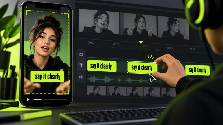
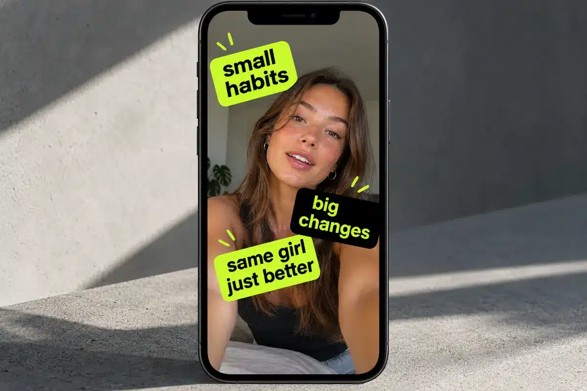
A strong TikTok caption graphic is short, readable, and timed to the mood of the video. Use the Brat Generator to create a bold starting phrase, then shape it around the clip instead of covering the entire screen with text. The best captions complement the action, capture the mood, and give viewers a reason to connect with the content.
Start With the Viewer’s Reaction
The first job of a caption is to make viewers feel or recognize something quickly. A caption can be a reaction, confession, warning, punchline, or tiny observation. Decide which role it plays before choosing the color or type.
A phrase that is funny in a group chat may feel confusing on a public video without context. Keep the main line visible long enough to read, and avoid placing it under interface buttons. The goal is to make the message instantly understandable without distracting viewers from the video itself.
Write Captions That Fit the Moment
Write the caption as spoken language. Short phrases such as “I knew it,” “not the plan,” or “be serious” can feel more natural than a long explanation.
Match the wording to the video’s beat and leave room for the movement around it. A useful caption adds a second layer to the clip instead of repeating what viewers can already see. Think about the emotion you want to create, whether it is humor, surprise, confidence, or relatable frustration.
Build a Clear Text Hierarchy
Use one dominant phrase and one optional supporting line. The dominant phrase should be larger and placed where the eye naturally lands. Supporting text can add timing, context, or a small punchline.
If both lines compete, remove the weaker one. A text-first design becomes stronger when every word has a job. Clear visual hierarchy also helps viewers understand the message when they encounter the video while scrolling quickly.
Use Color and Contrast Carefully
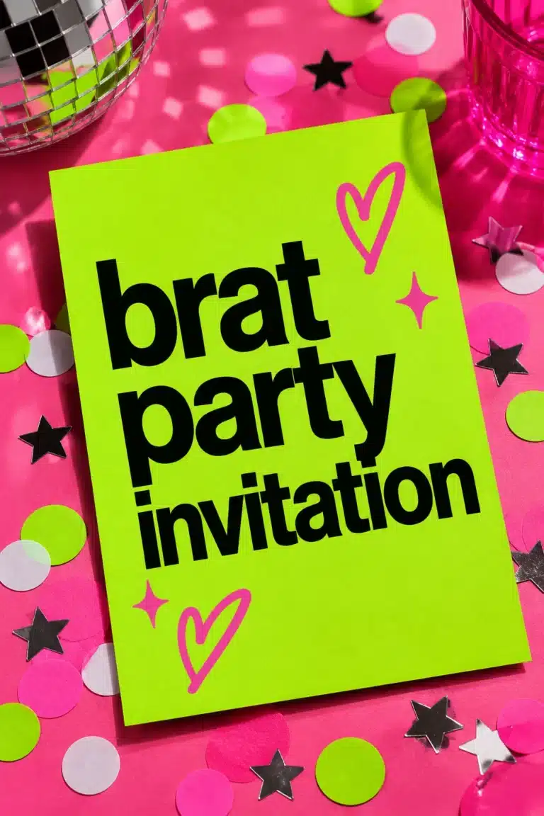
Lime and black create a recognizable high-contrast starting point, but the background still needs enough separation from the lettering. Test the graphic at thumbnail size and on a dim phone screen.
Avoid pale text on a pale background, thin outlines, and busy photos behind important words. Strong contrast makes the caption easier to read, while a simple background helps the main phrase remain the focal point.
Keep the Composition TikTok-Friendly
Vertical video needs safe margins at the top and bottom. Keep important text away from the username, buttons, captions, and progress controls.
Export a version that leaves breathing room rather than stretching the phrase to every edge. A clean frame looks more confident and is easier to reuse across clips.
Before publishing, preview the graphic in its intended vertical layout. Text that looks perfectly positioned in an editing tool may become obstructed when platform controls appear on the screen.
Add Personality Without Clutter
Personality can come from an unexpected line break, a blunt phrase, or a slightly imperfect block. It does not require stickers, shadows, gradients, and several fonts at once.
Repeat one shape or accent across a series so the posts feel related without becoming identical. Consistency can make your content recognizable, while small changes in wording and composition keep individual posts interesting.
Check the Export Before Posting
Watch the finished export once before posting. Check spelling, cropping, transparency, color, and whether the text remains readable during motion.
Keep the source file and final export together. A low-resolution graphic can look acceptable in an editor and become soft after the platform processes it.
Review the design at the size viewers will actually see, not only at full-screen zoom. A useful test is to hide the sound and ask whether the caption still communicates the intended reaction. Save a clean master so the same idea can be adapted for another clip without rebuilding it.
Brat TikTok Caption Examples Worth Testing
The best caption often creates an unexpected connection between the words and the action on screen. Try a deadpan caption over an overexcited clip, a calm phrase over chaos, or a tiny admission after a confident action.
Here are a few short phrases you can adapt to different video moods:
- For an unexpected moment: “I knew it.”
- For a plan going wrong: “Not the plan.”
- For an unbelievable situation: “Be serious.”
- For a confident reveal: “Exactly as intended.”
- For a chaotic moment: “Everything is fine.”
- For a relatable confession: “Okay, that was me.”
For a duet or reply, keep the caption short enough that the original video remains visible. For a story sequence, use the first card as a hook and later cards as context.
You can also experiment with line breaks, text size, and color contrast to make familiar phrases feel more distinctive. Original wording and specific timing help a familiar visual format feel like your own creative work.
Final Thoughts
Effective Brat-style TikTok captions combine concise wording, clear typography, strong contrast, and timing that matches the video. A simple phrase can communicate more than a crowded graphic when every design choice supports the intended reaction.
Experiment with different caption styles, review your graphics on a phone screen, and keep reusable source files for future posts. Focus on making each caption readable, relevant, and original so it complements your content instead of competing with it.
Frequently asked questions
How long should a TikTok caption be?
Use the shortest wording that preserves the joke and communicates the intended reaction. Short phrases are often easier to read while viewers watch a moving clip.
Where should caption text sit on the screen?
Keep it in a quiet area of the frame, away from interface controls, usernames, and other on-screen text. Leave enough space around the words to maintain readability.
Can I use more than one font?
Yes, but one strong type style is usually clearer. If you use a second font, make sure it supports the main message rather than competing with it.
Should every Brat-style caption use lime green?
No. Lime and black are a recognizable starting point, but preserving contrast and a text-first design is more important than using the same color combination in every graphic.
Why does my caption image look blurry?
Start with a sufficiently large canvas and avoid repeatedly exporting compressed versions. Review the image at the size viewers will actually see, and keep a clean master file for future edits.
How can I tell whether my caption works?
Hide the sound and see whether the caption still communicates the intended reaction. If the message is unclear, simplify the wording or adjust the text placement and timing.
Brat Generator is an independent tool and is not affiliated with, endorsed by, or sponsored by Charli XCX, her record label, or any related brand. Any album or trademark names are mentioned only to describe a visual style.