How to Design Brat-Style Subtitle Cards for Short Videos
How to Design Brat-Style Subtitle Cards for Short Videos
You can create Brat-style subtitle cards by turning short lines into separate text graphics, placing them inside the video safe area, and timing each card to the spoken words. This is a manual design workflow, not automatic speech transcription.
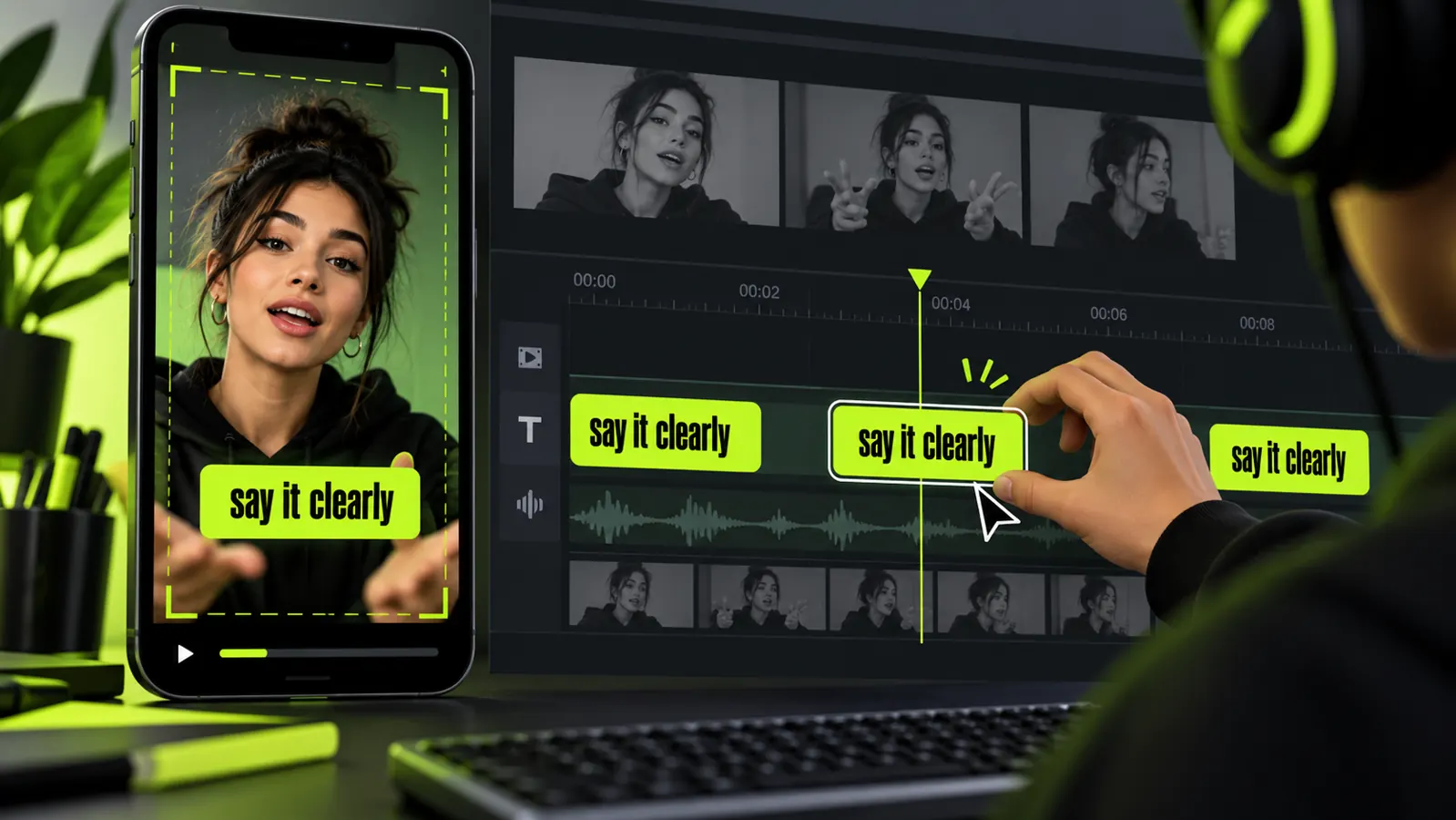
Use the free Brat text generator to create each visual line, then arrange the exports in a video editor. The result works best when the cards are brief, readable, accurate, and consistent throughout the clip.
Decide whether you need captions or designed cards
Captions reproduce spoken content for accessibility and comprehension. Designed subtitle cards are visual emphasis elements that may show selected phrases.
If your video contains speech, accurate full captions remain important. A few decorative cards should not replace a complete caption track when viewers need the dialogue.
Use designed cards for a title, a key statement, a transition, or a short repeated phrase. Use platform captions or a verified caption file for the full spoken message.
This distinction prevents a common mistake: creating attractive text that leaves parts of the audio inaccessible.
Start with an accurate transcript
Write down every spoken sentence before designing. Listen again and correct names, numbers, and unusual terms.
Automatic transcripts can provide a starting point, but they require human review. A single wrong word can change the meaning of a tutorial, quote, or factual statement.
Mark the phrases you want to emphasize visually. Choose lines that can stand alone and remain understandable without the previous sentence.
Do not use copyrighted lyrics simply because they fit the visual theme. Use your own narration or wording you have permission to display.
Break the text into short readable units
Each card should express one idea. Short units let viewers read without pausing the video.
A practical target is three to eight words per card. This is a design guideline rather than a fixed rule. Familiar words can be read faster than names, numbers, or technical terms.
Break lines at natural grammatical points. Keep an adjective with its noun and avoid separating a short name across two cards.
For example, turn “three quick ways to improve your cover design” into “three quick ways” followed by “to improve your cover design.” Each piece remains meaningful.
Generate a consistent text set
Create the first card and use it as the style reference. Keep the same text scale, color treatment, padding, and alignment for the remaining set.
Export every card with a transparent background when possible. Transparency makes it easier to place the words over different video scenes.
Name files in playback order, such as 01-three-quick-ways.png, 02-improve-your-cover.png, and 03-check-the-export.png. Numbered names reduce mistakes when several cards look similar.
Do not change the style on every sentence. Consistency helps viewers understand that each card belongs to the same sequence.
Choose the right video canvas
Most short-form mobile videos use a vertical 9:16 frame. Build the edit at the final output dimensions rather than resizing it after the cards are placed.
Review the TikTok image and video size guide for current layout planning. Platform interfaces can cover areas near the top, bottom, and right edge.
Keep subtitle cards inside the central safe region. A line that appears clear in the editor may sit behind a caption field, profile icon, or interaction button in the published view.
Save a test draft and preview it in the relevant app when possible. Interface layouts can change, so a real preview is more reliable than a permanent pixel rule.
Place cards without hiding the subject
The lower third is familiar, but it is not always the best location. If the speaker’s hands, product, or demonstration occupies that area, move the card higher.
Maintain a consistent horizontal alignment. Jumping from left to center to right on every cut makes the viewer work harder.
Track important movement. If the subject crosses behind the words, reposition the card between scenes or use a solid panel that preserves contrast.
Never cover essential on-screen instructions with a decorative subtitle. Combine the messages or revise the shot so both remain readable.
Create strong contrast
Text must remain readable over every frame during its display time. Video backgrounds change, even within a two-second clip.
Preview the beginning, middle, and end of each card. A light background may enter the frame after the first moment and make light text disappear.
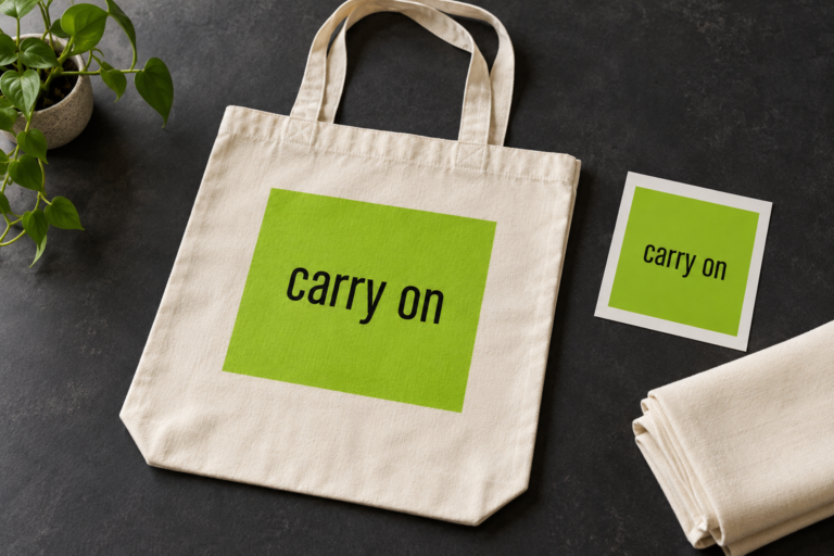
Use a solid green card behind dark text when the footage varies heavily. The panel creates predictable contrast and reinforces the intended style.
If you use text without a panel, add only enough outline or shadow to maintain clarity. Heavy effects can make the letters look muddy after video compression.
Time each card to speech
Place the card when the relevant phrase begins and remove it after the phrase ends. Early text can spoil a joke or reveal a point before the speaker makes it.
Late text forces viewers to process two moments at once. Move the card earlier if the next sentence begins before the current line disappears.
Leave a card visible long enough for an average viewer to read it once without rushing. Longer words, numbers, and unfamiliar names require more time.
Watch the sequence at normal speed without stopping. If you miss a card, simplify the wording or extend its duration rather than shrinking more words into the same time.
Use animation with restraint
A simple cut, quick fade, or short scale-in is enough for most subtitle cards. The words should attract attention without becoming harder to read.
Avoid rapid flashing and repeated shaking. These effects can distract viewers and create accessibility concerns.
Apply the same entry and exit behavior throughout the clip. A repeatable motion becomes part of the visual system and speeds up future editing.
If the video already contains fast camera movement, use calmer text animation. Motion should be balanced across the whole frame.
Keep full captions available
Designed cards highlight selected language. Full captions communicate all meaningful speech and relevant sounds.
Use the platform’s caption tool, an edited subtitle file, or burned-in captions that have been checked carefully. Confirm spelling, timing, speaker changes, and punctuation.
Do not position the full caption line and the designed card on top of each other. Reserve separate zones or show the emphasis card briefly above the caption area.
When no speech is present, describe important non-speech audio when it affects understanding, such as a door closing or an alarm sounding.
Build a reusable template
Create one project with a vertical canvas, safe-area guides, a card layer, and a placeholder for each line. Duplicate it for the next video.
Store the chosen color, padding, alignment, and animation duration in a short style note. A documented system prevents gradual inconsistency.
The Brat generator and CapCut comparison explains the roles of generating a visual asset and assembling it in a video editor. Use the generator for the card design and the editor for timing, motion, audio, and final export.
For Story versions, the Brat Instagram Story guide provides additional layout context. Recheck interface-safe areas because Stories and feed videos do not present identical controls.
Export and review the full video
Export a high-quality test version at the intended aspect ratio. Watch it on a phone with the sound on, then watch it again with the sound off.
The sound-on review checks timing against speech. The sound-off review shows whether the captions and cards communicate enough context by themselves.
Look for compression damage around letter edges, especially on high-contrast green panels. If the text looks rough, increase the export quality and avoid repeated re-encoding.
Check the first and last frames. Text that starts before the video or remains after a cut can look like an editing error.
Ask another person to watch once without pausing. Their first reaction is more useful than a designer’s repeated, memorized playback.
Common subtitle-card mistakes
Treating a design card as complete captions
A few emphasized phrases do not provide the full spoken content. Add accurate captions for the rest of the audio.
Showing too many words
Long sentences demand small type and extended reading time. Divide the sentence at a natural pause or keep only the essential phrase on the designed card.
Ignoring changing backgrounds
A card may begin over a dark wall and end over a bright window. Check every moment and use a solid panel when contrast changes.
Placing text under interface controls
Leave generous margins and preview in the destination platform. Do not assume the editor canvas represents the final visible area.
Using inconsistent spelling or punctuation
Create cards from the corrected transcript, not from memory. Recheck names and numbers before export.
Overusing animated effects
Constant bouncing, distortion, and flashing reduce comprehension. One restrained transition is usually stronger.
A repeatable production checklist
Use this order for every short video:
- Transcribe and verify the speech.
- Select a few standalone emphasis phrases.
- Break each phrase into three to eight readable words.
- Generate a consistent transparent card set.
- Number the exported files in playback order.
- Place cards inside the platform safe area.
- Match each card to the correct spoken moment.
- Add and verify full captions separately.
- Review with sound on and sound off.
- Export once at the intended dimensions and quality.
Create your first card set
Start with an accurate transcript and select only the phrases that deserve emphasis. Generate each card in one consistent style, place it safely, and verify the timing at normal speed.
The best subtitle-card system is easy to read, accurate to the audio, and repeatable across future videos. Visual style supports the message; it should never replace clarity or complete captions.
Frequently asked questions
Does the generator create automatic subtitles from audio?
No. This workflow creates visual text assets. Transcription, caption timing, and video assembly happen in a suitable captioning or video-editing tool.
How long should each subtitle card stay on screen?
It should remain long enough to read comfortably at normal playback speed. Increase the duration for longer words, names, or numbers.
Can subtitle cards replace captions?
Not when they show only selected phrases. Provide accurate full captions for all meaningful speech and sounds needed to understand the video.
Where should I place the cards?
Use a consistent area that avoids the subject and the platform interface. Preview the actual destination because control positions can change.
Should every card use the green background?
No. Use a solid panel when it improves contrast and consistency. Transparent text can work when the footage remains quiet and readable throughout the card’s duration.