Brat Poster and Flyer Design: A Practical Guide for Digital and Print
A Brat-style poster or flyer is built around a strong visual decision: one bold background, one memorable phrase, and a clear information hierarchy. That makes the style useful for party announcements, club nights, creative projects, fan events, classroom boards, community notices, and digital promotions. It can look energetic without becoming cluttered.
This guide explains how to choose the right poster size, write the headline, organize supporting details, prepare the design for print or screens, and create the main graphic with the Brat Generator.
Poster versus flyer: choose the job first
A poster is usually viewed from a distance. It needs a short headline and a large visual hierarchy that can be understood in a few seconds. A flyer is often handed to someone or viewed on a phone, so it can contain more practical information. The same design system can support both, but the amount of text should change.
For a poster, ask: what should someone remember after walking past? For a flyer, ask: what does someone need to know before attending, buying, joining, or sharing? Answering those questions first prevents the common mistake of putting a full paragraph in a design that should act as a visual signal.
Common poster and flyer sizes
Choose the final format before building the canvas. A4 is a flexible general-purpose flyer size. A3 works for a wall poster. A 5 × 7 inch card can work as a handout or mini-poster. For digital sharing, use a square or vertical social format and keep the most important content in the center.
| Use | Practical size | Orientation |
|---|---|---|
| A4 flyer | 210 × 297 mm | Portrait |
| A3 poster | 297 × 420 mm | Portrait |
| Handout card | 5 × 7 in | Portrait |
| Square social graphic | 1080 × 1080 px | Square |
| Story or digital display | 1080 × 1920 px | Vertical |
For professional printing, ask the printer about bleed, safe margins, color mode, and file format. For a home printer, leave a generous border because many printers cannot print to the edge of the sheet.
The Brat poster formula
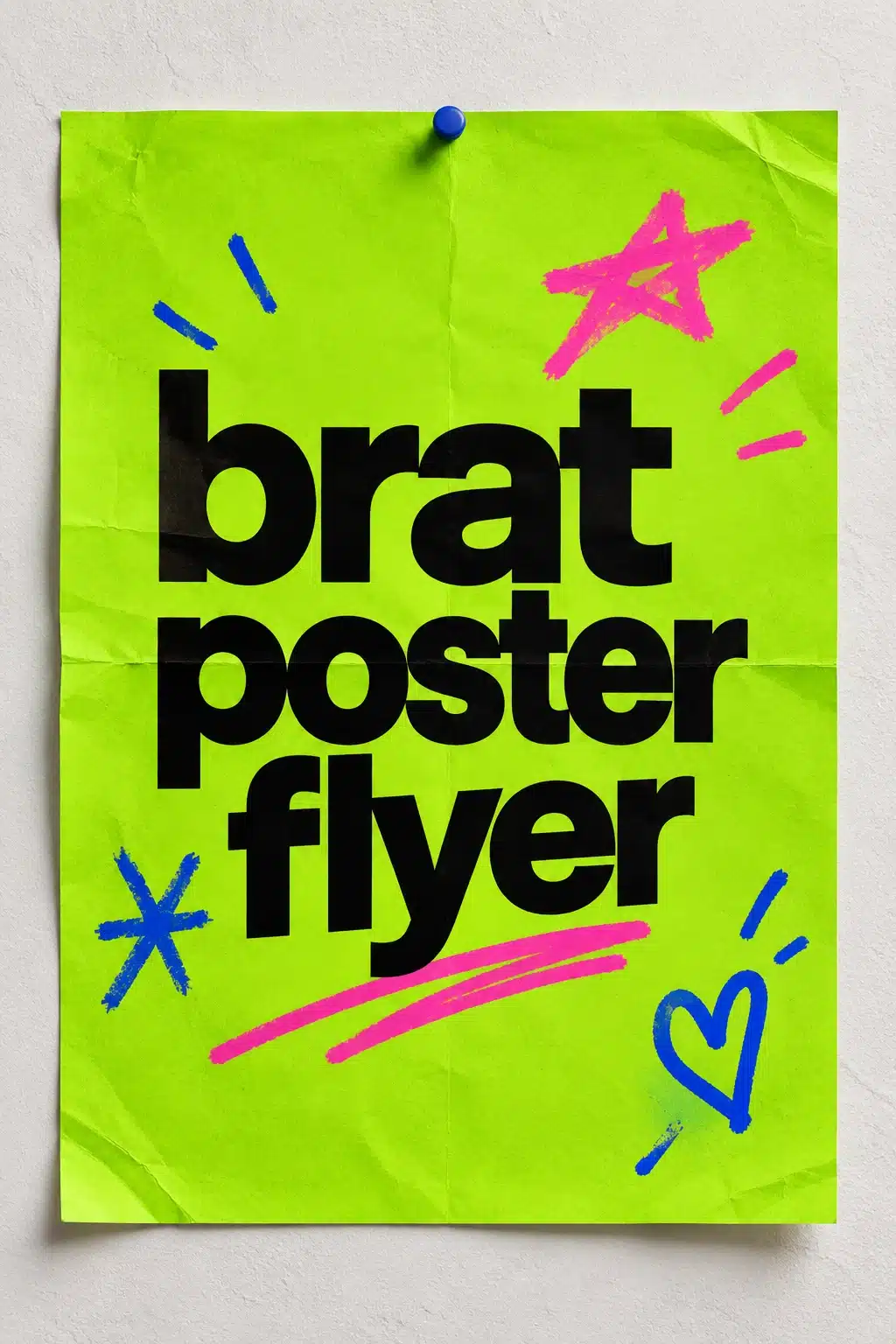
The style becomes recognizable through repetition of a few choices: a flat saturated background, bold lowercase type, high contrast, simple alignment, and a small amount of expressive imperfection. You can use green, black, white, hot pink, cyan, yellow, purple, or another custom color. The core is not a single required shade; it is the confidence of the layout.
Use #8ACE00 as a starting point for classic Brat Green, then test it on your actual screen or printer. Bright colors can appear differently under warm bulbs, office lighting, and inexpensive print cartridges. If the background is extremely bright, black type is usually the safest choice.
How to design a Brat poster or flyer
1. Write a short headline
Start with three to six words. Examples include “live at eight,” “creative market,” “green room,” “open studio,” or “new drop today.” The headline should carry the mood, not every logistical detail. If the event name is longer, split it into two lines and make the line break feel intentional.
2. Create the headline graphic
Open the Brat Generator and enter the headline. Choose a square, social, or custom canvas depending on your output. Adjust the font size, alignment, and background color until the words occupy the right amount of the field. A centered phrase is the most reliable poster treatment; left alignment can feel more editorial when the poster has a large empty margin.
For longer wording, use the Brat text generator and create several short text blocks rather than one dense sentence. For a square campaign cover, the Brat text generator can supply a matching visual for social previews.
3. Add an information hierarchy
After the headline, add only the information that changes what the viewer should do. A useful order is event type, date, time, place, call to action, and contact or URL. Use spacing to separate groups. You do not need a box around every line; contrast and alignment can create enough structure.
For a flyer, include a short description or list of highlights below the main headline. Keep it to a few lines. If there are terms, pricing details, or instructions, use a second page or a linked webpage rather than shrinking the type until it becomes difficult to read.
4. Choose a focal point
A poster should have one obvious entry point. That can be the headline, an abstract shape, a photo, or a product. In a Brat-style design, the headline is often the focal point. If you add a photograph, keep it secondary and avoid placing it behind type unless the contrast remains strong.
One color block, scribble, star, or underline can make the composition feel lively. Several decorative elements can quickly turn into visual noise. Add accents only after the message is readable without them.
Digital poster layouts
For social media, create a version that remains readable in a feed preview. A square format works well for a post, while a 1080 × 1920 design works for a Story or vertical screen. Keep the main phrase centered if the platform may crop the edges. Add links, polls, and RSVP stickers as native elements when possible so they remain interactive.
For a website banner, use a wide version with one short phrase and leave space for HTML text or a button. Do not bake every sentence into the image. Search engines and screen readers understand live page text better than a graphic containing all of the information.
Print preparation
Print a small proof before ordering many copies. Check that the headline is sharp, the black is dark enough, the green is not muddy, and the details are readable from the intended distance. If the poster is for a wall, stand several steps away. If it is a handout, read it at arm’s length.
For professional print, export using the printer’s requested settings and include bleed only when asked. Keep essential text inside the safe margin. If a design uses thin lines or tiny accents, increase their weight because print can soften them.
Accessibility and inclusive communication
A striking color does not replace clear wording. Use adequate contrast, avoid extremely small text, and do not communicate critical information by color alone. If you publish the poster online, repeat the date, time, location, and action as selectable HTML text near the image.
Use descriptive alt text, such as “lime-green Brat-style event poster with bold black headline and pink and blue hand-drawn accents.” If the poster is decorative and the same information appears in the surrounding copy, keep the alt text concise. If the image contains unique information, include that information in the article or caption as well.
Poster ideas by use case
For a party, use the event name as the hero phrase and put the date and venue underneath. For a community notice, make the action prominent: “join,” “bring,” “vote,” or “meet.” For a product flyer, use one benefit rather than a list of ten features. For a creative portfolio, use a short project title and let the color and type demonstrate the visual direction.
You can also make a small series. Keep the background color and type consistent, then change one word per poster. A set of three designs often feels more intentional than one graphic with every possible message crammed into it.
Mistakes to avoid
Do not design at the wrong ratio and crop later. Do not place text near the edge when the design will be printed or displayed in a feed. Do not use a low-contrast color pair. Do not rely on a decorative typeface that becomes illegible from a distance. Most importantly, do not let the style hide the purpose of the poster.
Avoid copying official album artwork, logos, or protected promotional materials. An original fan-inspired design can use bold color and lowercase typography without claiming an official relationship.
Final checklist
Choose the final size first, write a short headline, establish two core colors, create the headline graphic, add only necessary details, check contrast and margins, test print or preview at real size, repeat important information as HTML text online, and export a lightweight featured image. The Brat Generator is a fast starting point for the text-led portion of the layout.
FAQ
What is the best size for a Brat poster?
Use A3 for a wall poster, A4 for a general flyer, or a platform-specific digital canvas such as 1080 × 1080 or 1080 × 1920 pixels.
Can I make a printable poster online?
Yes. Create the headline graphic online, then assemble the full print layout at the final physical size in a design or document editor.
How much text should a poster contain?
Use a short headline and only the essential details. Put longer explanations on a webpage or second page.
Can I use Brat Green for commercial flyers?
You can use a color value and an original layout, but make sure your complete design does not imply endorsement or copy protected artwork.
Frequently asked questions
What size should a poster or flyer be?
Common sizes are A4, A3 and US Letter. Choose the size based on where it will be displayed and design at 300 dpi at final size for print.
Can I make a poster with only the generator?
Yes, for a headline-only poster. Export the headline and place it in a document or layout editor with your details.
How is this different from the event flyer guide?
This guide covers general poster layout and printing; the event flyer guide focuses on event information, QR codes and distribution.
Brat Generator is an independent tool and is not affiliated with, endorsed by, or sponsored by Charli XCX, her record label, or any related brand. Any album or trademark names are mentioned only to describe a visual style.