How to Make a Brat-Style Google Slides & PowerPoint Presentation
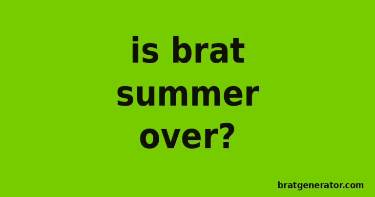
A brat-style Google Slides or PowerPoint deck uses the same flat lime-green backgrounds and bold lowercase title cards as Charli XCX’s Brat album cover — and you can build the title slides and section dividers for free with the Brat Text Generator, no template shop or design subscription required. Here’s how to build a full brat-style presentation for class, work, or a fan project, plus the sizing details that keep exported graphics sharp once they’re dropped into a slide.
Why Brat Works as a Presentation Theme
Most free slide templates lean toward soft gradients, rounded cards, or busy stock photography. A brat-style deck does the opposite — a flat, high-contrast background with one bold word doing all the work. That makes it a strong fit for presentations that need to stand out immediately: a class project on a pop-culture topic, a marketing pitch aimed at a younger audience, a portfolio review, or simply a personal deck someone wants to look current rather than like a default template. Because the look is built from color and typography rather than photography, it also holds up cleanly when a deck gets projected on a screen with uneven lighting, where photo-heavy templates often look washed out.
How to Build a Brat-Style Slide Deck
1. Plan which slides need a custom graphic
Not every slide needs a generated graphic — the title slide and each section-divider slide are where the bold text treatment has the most impact. Content-heavy slides (bullet points, charts, data) generally work better with a plain background so the brat-style graphics stand out as clear breaks in the deck rather than competing with dense text.
2. Open the Brat Text Generator and pick the right size
Go to the Brat Text Generator and choose a widescreen export — most modern decks in Google Slides and PowerPoint use a 16:9 ratio (1920 x 1080px or 1280 x 720px), which is noticeably wider and shorter than the square or portrait sizes built for social platforms. Exporting at the wrong ratio is the most common reason a downloaded graphic looks stretched or has awkward empty bars once it’s dropped into a slide.
3. Keep slide text to a title, not a paragraph
A section divider works best with one short phrase — a chapter title, a single word, or a two-to-three-word heading. Longer text shrinks to fit and loses the bold, chunky look that makes the style recognizable from the back of a room.
4. Insert the export as a full-bleed background
In Google Slides, use Insert > Image, then right-click and send it to the background, or use “Change background” from the slide menu. In PowerPoint, use Insert > Pictures, then right-click and choose “Send to Back,” or set it directly as the slide background through Design > Format Background. Either way, the export should fill the entire slide edge to edge rather than sitting as a smaller inset image.
Slide Size Reference
Getting the export ratio right the first time avoids having to redo graphics after they’re already placed in the deck:
| Slide Format | Recommended Export Size | Notes |
|---|---|---|
| Widescreen (16:9) | 1920 x 1080px | Default for Google Slides and modern PowerPoint decks |
| Standard (4:3) | 1024 x 768px | Older PowerPoint default, less common now |
| Title slide only | 1920 x 1080px | Same as widescreen; used for the opening slide specifically |
| Handout / print version | 2550 x 3300px (Letter, 300dpi) | If the deck will also be printed as a handout |
Building a Full Brat-Style Deck
Because every export from the generator uses the same font and color presets, keeping a whole deck visually consistent is a matter of reusing one color choice across every slide that needs a graphic, rather than re-matching a hex code by hand each time. A practical structure: a title slide, a divider before each major section, and a closing “thank you” or “questions” slide, all built from the same generator session so the green (or black or white) stays identical across the whole deck.
Common Mistakes With DIY Brat Slide Graphics
- Exporting a square or portrait graphic for a widescreen slide. A size built for Instagram or TikTok will either get stretched or leave empty bars on the sides — always match the export ratio to your actual slide dimensions.
- Putting a full sentence into the bold title font. The style is built for short phrases — long text shrinks down and loses the chunky, legible look that makes it work from a distance.
- Using the graphic on every single slide. The effect works because it marks a transition — using it on every slide, including dense content slides, makes text harder to read and dilutes the impact of the section breaks.
- Mixing colors between slides. Switching between green, black, and white dividers within one deck looks inconsistent — pick one and use it throughout, unless you’re deliberately color-coding different sections.
Google Slides vs. PowerPoint: What’s Different
Both apps handle a full-bleed background image slightly differently. Google Slides requires setting the image as the background through the slide menu (a plain inserted image can be resized and moved, but won’t auto-fill the canvas). PowerPoint offers a similar “Format Background” option, but also lets you simply resize an inserted image to cover the slide manually and send it behind any text boxes. If you’re building the deck for someone else to edit later, PowerPoint’s manual approach is easier for a less experienced user to adjust, while Google Slides’ background setting keeps the graphic locked in place so it can’t be accidentally moved.
Why the Aesthetic Works for Presentations
A room full of people looking at a projector screen is a lot like a phone screen scrolled past quickly — fine detail and subtle gradients disappear, and only bold shapes and high contrast actually register. That’s the same reason the brat look works as a phone wallpaper or stream banner, and it translates directly to a conference room or classroom: a flat green background with oversized lowercase text is legible from the back row in a way that a busy stock photo template usually isn’t.
Pairing Slide Graphics With Your Existing Brand
If the deck represents a business, club, or personal brand that already has a logo or color scheme, it’s worth deciding upfront whether the brat-style graphics should replace that branding for this one deck or sit alongside it. For a one-off presentation on a pop-culture or trend topic, going fully brat-styled usually works fine. For a deck that also needs to reinforce an existing brand, a lighter touch — using the bold typography treatment only on the title slide, with the rest of the deck in your normal brand colors — keeps the presentation recognizable as yours while still opening with something memorable. The same logic applies to a brat-style brand kit if you’re building this deck as part of a larger set of branded materials.
Frequently Asked Questions
What size should I export for a Google Slides or PowerPoint background?
1920 x 1080px for a standard widescreen (16:9) deck, which covers the vast majority of decks made in either app today.
Do I need design software to make brat-style slide graphics?
No. The Brat Text Generator runs entirely in your browser and exports a finished PNG with no watermark, install, or account.
Should I use the graphic on every slide?
No — it works best on the title slide and section dividers, so it reads as a clear transition rather than a repeated background that competes with the text on content-heavy slides.
How do I set the export as a full slide background in Google Slides?
Insert the image, then use the slide menu’s “Change background” option (or right-click and send the image to the back) so it fills the canvas edge to edge instead of sitting as a smaller inset.
Can I use this for a school project?
Yes — it works well for presentations on pop culture, design, or media topics specifically, and generally for any project where a more current, less generic template look is a plus rather than a distraction.
What if my deck uses a 4:3 ratio instead of widescreen?
Export at 1024 x 768px instead of the widescreen size — using a widescreen export on a 4:3 deck will either crop the sides or leave visible bars.
Is the export watermarked?
No. Every export from the Brat Generator, at any size or color, is completely free of watermarks.
Can I make a matching handout to print alongside the deck?
Yes — export at a print resolution (roughly 2550 x 3300px for a standard Letter page at 300dpi) rather than reusing the on-screen slide export, which will look soft when printed at full page size.
How long does it take to build a full set of slide graphics?
Because each export takes seconds, a full set — a title slide and three or four section dividers — typically takes under 15 minutes, including trying a couple of color options first.
What’s the difference between this and a template from a slide template site?
Template sites offer pre-built decks you fill in, while the Brat Text Generator builds just the background graphics — giving you full control over wording and layout rather than adapting someone else’s fixed template structure.
Once your title slide and dividers are ready, the same tool covers any handout covers or social recap graphics too — the Album Cover Generator works well for a square version if you need to share a slide as a standalone social post afterward.