How to Make a Brat-Style Notion Cover (Exact Size Guide)
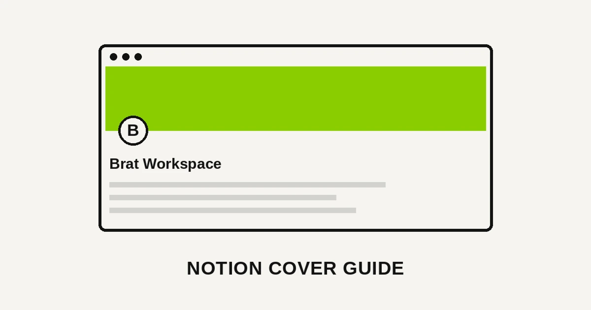
Quick answer: A Brat-style Notion cover is a flat-color image exported at 1500 x 600 pixels (a 5:2 ratio) — usually Brat Green or black, with a single bold word positioned to survive Notion’s mobile crop. That size displays cleanly on both desktop and mobile without stretching.
A cluttered Notion workspace full of default gray page headers looks unfinished, even when the content inside is organized. One flat color and one word per cover fixes that without touching a single database or template.
Why Notion Covers Are Worth the Five Minutes
A cover sits at the top of every page, visible before anyone reads a single line of content. It’s the first visual signal of whether a workspace was set up carefully or thrown together.
A matched set of covers across your dashboard, project pages, and notes reads as an intentional system. A mix of Notion’s stock gradients and random stock photos reads as the opposite.
Because the design is just one flat color and one word, applying it across a dozen pages takes minutes, not a redesign per page.
The Exact Sizes Notion Actually Uses
| Device | Recommended Size | Aspect Ratio | Notes |
|---|---|---|---|
| Desktop | 1500 x 600px | 5:2 | Standard recommended cover size for full-width desktop display |
| Mobile | 1170 x 445px | Roughly 2.6:1 | Notion crops covers differently on mobile — center your design to survive both |
| Higher-resolution upload | 3000 x 1200px or 2500 x 1000px | 5:2 | Wider uploads stay sharp on large or high-DPI desktop screens |
Notion resizes and crops your cover dynamically depending on the device and window width, so there’s no single crop that’s completely safe at every size.
Keeping your text or icon centered horizontally, rather than placed near the left or right edge, is what keeps a cover legible whether it’s viewed on a phone or a wide desktop monitor.
Building Your Cover Step by Step
1. Open the Brat Text Generator and set a custom canvas to 1500 x 600 pixels, Notion’s standard recommended desktop cover size.
2. Keep the wording to one or two words. A page title, a project name, or a single mood word reads clearly across the full-width banner; a full sentence gets lost once the cover crops on mobile.
3. Center your text horizontally in the middle of the canvas, since Notion’s mobile crop trims more from the left and right edges than the desktop view does.
4. Pick one flat background color and reuse it across every page in the same workspace or project, so the whole dashboard reads as one system.
5. Export as a PNG and upload directly as your page cover — no cropping needed first, since Notion handles the responsive resizing automatically.
Matching Covers Across a Workspace
A shared color per project — one flat color for every page inside a single project — makes it easy to tell which project a page belongs to at a glance, even before reading the title.
A shared color for your whole workspace, with the page title as the only variable, creates the most minimal, cohesive look across every page you open.
A different color per page type — one for meeting notes, one for project trackers, one for personal pages — adds a layer of at-a-glance organization on top of the visual consistency.
Choosing a Color for Your Workspace
Brat Green is the most recognizable choice and works well for a personal workspace where you want the aesthetic to be immediately obvious every time you open Notion.
Brat Black offers a more neutral, professional base — a better fit for a shared team workspace or a client-facing Notion site where high-saturation green might feel too casual.
Brat Pink softens the look for a personal planning, journaling, or lifestyle workspace that wants the aesthetic without the higher-contrast intensity of green or black.
Common Mistakes to Avoid
Placing text near the left or right edge. Notion’s mobile crop trims the sides more aggressively than desktop, so edge-anchored text often gets cut off on a phone.
Uploading a low-resolution image. An image under 1500 pixels wide can look soft once stretched across a full-width desktop cover. Export at or above the recommended size.
Using a different color on every page. Mixing colors across a workspace undercuts the cohesive look a one-color system is designed to deliver.
Overcrowding the cover with text. Keep it to a title or a single word; move any additional context into the page content itself, not the cover.
Building a Cover Library for Reuse
Since the canvas size and color usually stay the same across a project, building four or five cover variations — one per color, or one per page type — takes only a few minutes once the first is set up.
Keeping your exported covers in a shared folder, rather than making a new one from scratch each time, means applying a consistent cover to a new page takes seconds.
Sharing that cover library with teammates, for a shared workspace, keeps everyone’s new pages visually consistent without each person redoing the design work.
Notion Covers vs. Page Icons
A page cover and a page icon serve different roles — the cover sets the overall visual tone, while the small icon next to the page title works more like a quick-glance label in the sidebar.
Pairing a flat-color cover with a simple icon (a single emoji or a small symbol) extends the same one-color system down into the sidebar, where covers themselves aren’t visible.
Keeping the icon simple — one emoji or a plain shape — matches the same minimal philosophy that keeps the cover itself uncluttered.
Updating Covers for a New Quarter or Project
Because the design is just one flat color and one word, swapping the text for a new quarter, project name, or season takes seconds rather than a full redesign.
Keeping a note of your exact 1500 x 600 canvas size means a refresh is just changing the word and re-exporting at the same settings — no need to relearn the sizing.
This makes the format well suited to a workspace that gets refreshed periodically, without the covers ever needing new dimensions.
Using Covers for Shared or Public Notion Pages
A public-facing Notion page — a portfolio, a resource hub, a shared client doc — benefits even more from a consistent cover system, since first-time visitors judge the whole page by that first visual impression.
For a public page, exporting at the higher-resolution option (3000 x 1200px) helps the cover stay sharp on the large desktop screens most first-time visitors are likely to be using.
The same one-color, one-word approach that works for a private workspace applies just as well here — it just carries more weight when strangers, not just you, are the ones seeing it.
A Quick Reference Before You Export
If you only remember one setting: export at 1500 x 600 pixels and keep your text centered. That combination survives Notion’s responsive crop on both desktop and mobile.
Everything else — color, wording, icon pairing — is a matter of preference. Getting the size and centering right is what determines whether your cover looks sharp instead of stretched or cropped.
Frequently Asked Questions
What size should a Notion cover image be? 1500 x 600 pixels is Notion’s standard recommended desktop cover size, at a 5:2 aspect ratio. For sharper results on large screens, export at 3000 x 1200px instead.
Does the cover look different on mobile? Yes. Notion crops covers to roughly 1170 x 445 pixels on mobile, trimming more from the left and right edges than the desktop view does — center your design to survive both.
Do I need design software to make a Notion cover? No. The Brat Text Generator lets you set a custom 1500 x 600 canvas directly in the browser and export in seconds.
Why does my Notion cover look stretched? This usually means the uploaded image was narrower than 1500 pixels. Re-export at exactly 1500 x 600 pixels, or larger, to avoid Notion stretching a low-resolution file.
Should every page in my workspace use the same cover color? For the most cohesive look, yes — though using a different color per project or page type can also add useful at-a-glance organization.
Can I use the same cover design for a public-facing Notion page? Yes, and it matters even more there, since first-time visitors judge a public page by its cover before reading any content. Export at the higher resolution for sharper results.
What’s the difference between a cover and a page icon in Notion? The cover sets the overall visual tone at the top of the page; the icon is a small symbol next to the title that also shows in the sidebar. Pairing both extends your cover’s system further.
How do I update a cover across many existing pages? Notion doesn’t have a bulk-cover-update tool, so covers need to be replaced page by page — starting with your most-viewed pages first makes the improvement visible fastest.