How to Make Brat-Style Instagram Highlight Covers (Exact Size Guide)
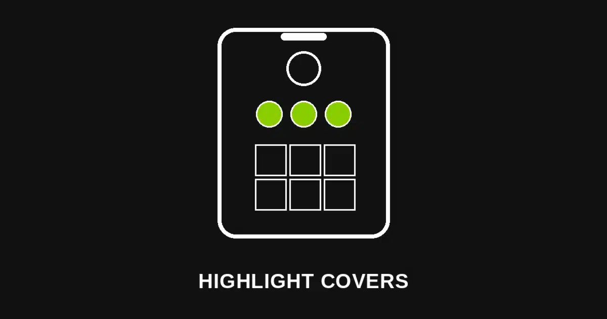
Quick answer: A Brat-style Instagram highlight cover is a flat-color square exported at 1080 x 1920 pixels. Instagram crops it to a circle for your profile, so keeping the icon or word centered in the middle of that tall canvas is what actually matters.
A profile with five mismatched highlight icons reads as unfinished, even when the posts underneath are polished. One flat color and one simple icon per category fixes that in minutes, not hours.
Why Highlight Covers Matter More Than They Seem
Highlight covers sit permanently under your bio, visible before a visitor taps into a single story. They’re the first design decision most profile visitors actually see.
A mismatched set — different colors, different fonts, some blank — signals a profile nobody has finished setting up. A matched set signals the opposite, even if it took five minutes.
Because every highlight uses the same treatment, adding a new category later takes seconds instead of becoming its own design decision every time.
The Exact Size Instagram Actually Uses
| Element | Size | Notes |
|---|---|---|
| Highlight cover upload | 1080 x 1920px | Standard Story-size canvas; this is what you design and export |
| Aspect ratio | 9:16 | Matches Instagram’s Story format |
| Displayed icon | Circular crop, 1:1 | Instagram crops the center of your upload into a circle for the profile view |
| Safe zone for icon/text | Centered within roughly the middle 1080 x 1080px | Keeps your icon inside the circular crop, not cut off at the edges |
Instagram takes your full 1080 x 1920 upload and crops it into a small circle for the profile row — so anything near the top or bottom edges of your canvas gets cut off entirely.
Designing at the full Story size, then keeping your icon or word centered in the middle square, is what keeps the final circular icon from clipping your design.
Building Your Highlight Cover Step by Step
1. Open the Brat Text Generator and set a custom canvas to 1080 x 1920 pixels, matching Instagram’s Story-size upload requirement.
2. Keep your icon or word short. A single letter, a small symbol, or a two-or-three-letter abbreviation reads clearly at the small size a highlight icon displays; a full word often gets lost.
3. Center everything in the middle third of the canvas. Since Instagram crops to a circle from the center, anything near the top or bottom edge won’t appear in the final icon.
4. Pick one flat background color and reuse it across every highlight in your profile, so the row reads as one deliberate set rather than five separate designs.
5. Export and upload directly as your highlight cover image — no cropping needed first, since Instagram handles the circular crop automatically on its end.
Choosing What Goes on Each Icon
A single letter works well when your highlight categories are short and distinct — “T” for travel, “F” for food — and stays legible even at the small profile-row size.
A simple symbol — a star, a heart, a small icon shape — reads faster than text at a glance and doesn’t rely on the viewer recognizing an abbreviation.
No text at all, just the flat color, works for a minimalist profile where the highlight names below each icon already do the labeling work.
Matching Your Color to Your Brand
Brat Green is the most recognizable choice if your whole profile already leans into the aesthetic — feed, bio link, and highlights all reading as one visual system.
Brat Black offers a more neutral, versatile base that works whether your feed content itself is colorful or minimal, without competing with your photos.
Brat Pink softens the look for a lifestyle or personal-brand profile that wants the aesthetic without the higher-contrast intensity of green or black.
Common Mistakes to Avoid
Uploading a photo instead of a flat design. A busy photo crammed into a small circular crop usually reads as a blur; a flat color with one simple icon stays legible at any size.
Placing the icon too close to the edges. Anything outside the centered safe zone gets cropped away entirely once Instagram converts your upload into a circle.
Using a different color for each highlight. Mixing colors across your highlight row undercuts the cohesive look a one-color system is designed to deliver.
Skipping a preview before publishing. Always check how your highlight looks in the actual profile row before finalizing — small icons can look different than they do at full size in the editor.
Building a Full Highlight Set at Once
Since the canvas size and color stay the same across every cover, building four or five highlight icons in one sitting takes only a few minutes once the first one is set up.
Keep a note of your exact settings — canvas size, color, font size — so adding a new highlight category months later matches the original set exactly.
Exporting the whole set together, rather than one at a time as needed, also makes it easier to catch any inconsistency in color or icon size before publishing.
Updating Highlights for a New Campaign or Season
Because the underlying design is just one flat color and one small icon, refreshing your whole highlight row for a launch, a season, or a rebrand takes minutes rather than a full redesign.
Reusing the same 1080 x 1920 canvas size for every refresh means you never have to relearn the sizing — just swap the color or icon and re-export.
This makes the format well suited to a profile that updates its look periodically, without the highlight covers ever needing new dimensions.
Highlight Covers vs. Your Profile Photo
Your profile photo and your highlight covers are cropped differently — the profile photo is already a circle you upload directly, while highlight covers are Story-size images Instagram crops down.
Matching your highlight color to your profile photo’s background, where possible, extends the cohesive look from the very top of your profile all the way through the highlight row.
Neither element needs to match your feed photos exactly, but a shared color across profile photo and highlights reads as one considered brand rather than two separate decisions.
Highlight Names and Icon Pairing
A highlight named “Travel” paired with a plane symbol or the letter “T” reads faster than a highlight name alone, since visitors scan icons before they read the small text label underneath.
Keeping highlight names short — one word where possible — matches the same one-word-per-icon philosophy that keeps the whole row visually consistent.
If a category needs a longer name, letting the icon stay simple (a single letter or symbol) keeps the visual weight balanced against the longer text below it.
Refreshing an Existing Highlight Set
If your current highlights already use mismatched photos or colors, replacing them one at a time still works — Instagram lets you edit a highlight’s cover without recreating the highlight itself.
Starting with your most-viewed highlight first means the visual improvement is immediately visible to the largest share of profile visitors before you finish the rest.
A full replacement in one sitting looks more intentional than a gradual swap, but either approach reaches the same matched result eventually.
A Quick Reference Before You Export
If you only remember one setting: export at 1080 x 1920 pixels and keep your icon centered in the middle. That combination is what survives Instagram’s circular crop cleanly.
Everything else — color, icon choice, highlight names — is a matter of preference. Getting the centering right is what determines whether your icon looks intentional or accidentally cropped.
Frequently Asked Questions
What size should an Instagram highlight cover be? 1080 x 1920 pixels, matching Instagram’s standard Story-size upload. Instagram then crops the center of that image into a circle for your profile.
Why does my highlight icon look cut off? This usually means your icon or text was placed too close to the top or bottom edge of the canvas. Keep everything centered within the middle square of your 1080 x 1920 design.
Do I need design software to make highlight covers? No. The Brat Text Generator lets you set a custom 1080 x 1920 canvas directly in the browser and export in seconds.
Should every highlight use the same color? Yes, for a cohesive profile — using one flat color across every highlight cover is what makes a mismatched-looking profile read as intentionally designed.
Can I use a photo instead of a flat color for my highlight cover? You can, but a photo often looks blurry once cropped down to the small circular icon size. A flat color with a simple icon stays legible at any size.
How do I update an existing highlight’s cover image? Instagram lets you edit a highlight’s cover without deleting the highlight — open it, tap edit, and replace the cover image with your new export.
What should I put on each highlight icon? A single letter, a simple symbol, or no text at all if your highlight name already labels the category clearly. Avoid full words, which get lost at the small display size.
Does the highlight cover size differ between iPhone and Android? No. Instagram’s highlight cover upload size is the same 1080 x 1920 pixels across iOS, Android, and desktop uploads.