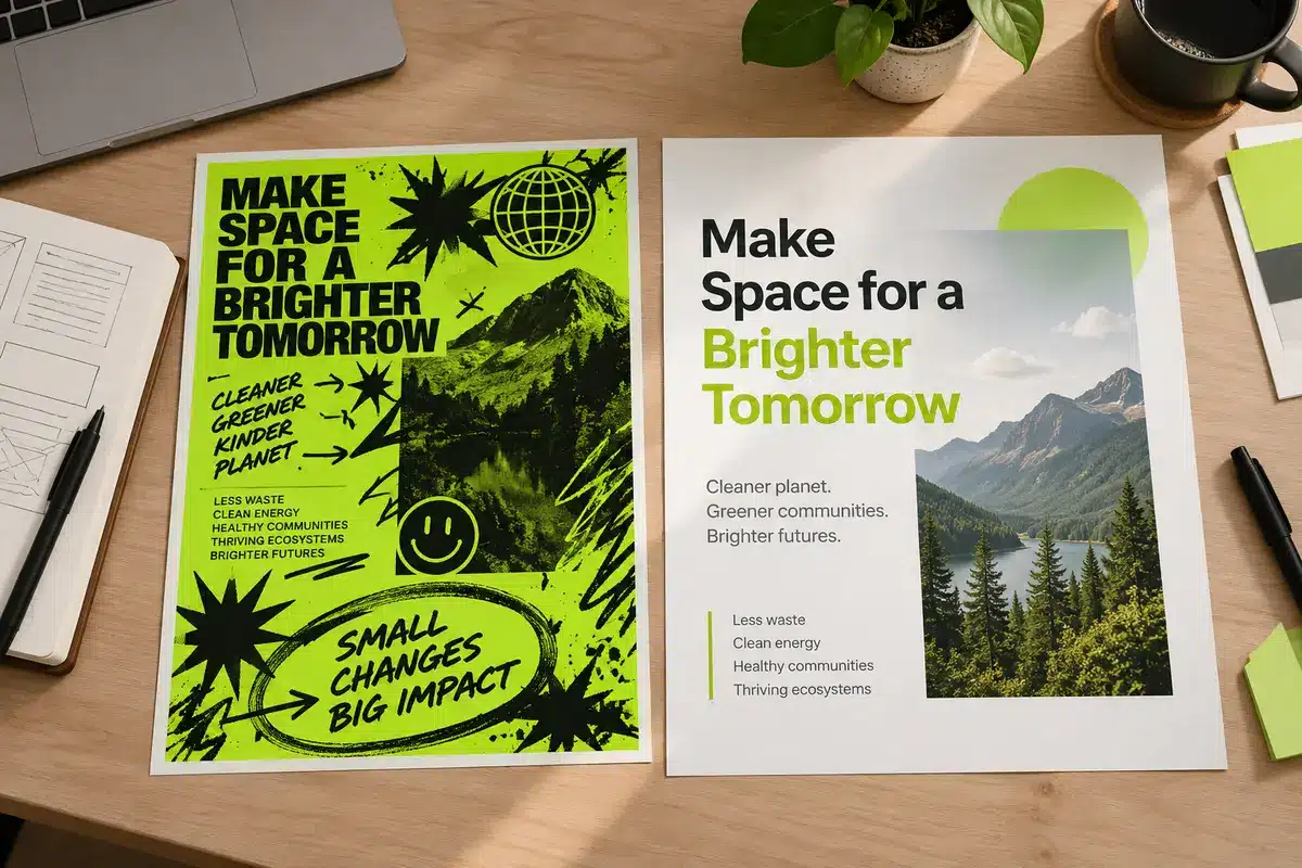
Brat Style Graphic Design Mistakes to Avoid
Simple text graphics may look easy to create, but small design decisions can make them unreadable or generic. This guide covers common brat-style design mistakes and explains how to improve text hierarchy, spacing, contrast, export quality, and platform compatibility. Start with the brat generator and refine your design with intention.
1. Avoid Unclear Text Hierarchy
One of the most common design mistakes is giving every word the same visual importance. When the main phrase competes with supporting text, viewers may struggle to understand the message quickly.
Use one dominant phrase and, if necessary, a smaller supporting line. Place the main text where the eye naturally lands, and remove any words that do not add meaning.
2. Write Captions That Fit the Moment
Write captions in natural, conversational language. Short phrases such as “I knew it,” “not the plan,” or “be serious” can feel more relatable than a long explanation.
Match the wording to the video’s mood and rhythm. A useful caption adds another layer to the content instead of simply repeating what viewers can already see.
A phrase that works in a group chat may feel confusing on a public video without context. Consider what the viewer needs to understand before finalizing the wording.
3. Use Color and Contrast Carefully
Lime green and black provide a recognizable, high-contrast starting point for brat-inspired designs. However, choosing familiar colors does not automatically make a graphic readable.
Avoid pale lettering against a pale background, thin outlines that disappear at smaller sizes, and busy photographs behind important words. Preview the graphic at thumbnail size and on a dim phone screen before publishing.
4. Fix Spacing and Composition
Crowded text can make an otherwise strong design feel unfinished. Leave enough space around the lettering so the main phrase remains easy to recognize.
For vertical videos, keep important text away from usernames, buttons, captions, and progress controls. Avoid stretching words to every edge of the frame. A balanced composition is easier to read and reuse across different clips.
5. Add Personality Without Clutter
Personality can come from an unexpected line break, a blunt phrase, or a slightly imperfect text block. It does not require multiple fonts, stickers, shadows, and gradients in the same graphic.
Choose one or two consistent visual elements and repeat them across a series. This creates a recognizable style without making every post look identical.
For typography inspiration, compare your layout with the brat font style guide. Focus on the overall lettering style and readability rather than assuming that any particular font is officially associated with the original artwork.
6. Keep the Design Platform-Friendly
A graphic that looks good in an editing canvas may not work equally well on every social platform. Different placements can crop the image or cover parts of the design with interface elements.
Before exporting, check the intended aspect ratio and leave sufficient safe space around the text. If the graphic will appear over a moving video, make sure the caption remains readable without obscuring the important action.
For reaction images, the goal is to make the emotion recognizable almost immediately.
7. Check Export Quality Before Posting
Low-resolution graphics can look acceptable in an editor but become blurry after uploading. Repeatedly compressing the same image can make the lettering appear soft or distorted.
Before publishing, check:
- Spelling: Make sure every word is correct.
- Crop: Confirm that no important letters are cut off.
- Resolution: Use a canvas suitable for the intended platform.
- Transparency: Check that the background behaves as expected.
- Color: Confirm that the lettering and background remain distinct.
- Motion readability: Watch the graphic in context if it appears in a video.
Keep the source file and final export together so you can make future edits without rebuilding the design.
8. Maintain Consistent Colors and Clean Edges
Consistent colors help related graphics feel like part of the same visual series. If you are creating multiple designs, use a repeatable color reference rather than selecting a slightly different shade every time.
The brat green color code guide can help you maintain a consistent green across your designs. Always test the selected shade against your text color and background before using it in a series.
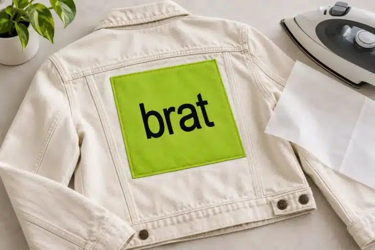
If your design will be used for craft projects or merchandise, file quality becomes even more important. The brat SVG and Cricut guide explains why clean vector paths matter when preparing artwork for cutting and other production workflows.
9. Test the Graphic in Real Use
Do not judge a design only by how it looks at full-screen zoom. View it at the size people will actually encounter in a feed, chat, or vertical video.
Try a deadpan caption over an overexcited clip, a calm phrase over a chaotic moment, or a short confession after a confident action. For a duet or reply, keep the text brief enough that the original video remains visible.
A useful test is to hide the sound and ask whether the caption still communicates the intended reaction. If the message depends on a lengthy explanation, simplify the wording or provide more context in the surrounding post.
Final Design Checklist
Before publishing, review the text hierarchy, spacing, contrast, crop, and export quality. Make sure the caption fits the platform and communicates the intended reaction without unnecessary explanation.
Save a clean master file for future edits, and keep visual elements consistent when creating a series. A familiar text-first aesthetic can still feel original when the wording, composition, and timing reflect your own creative choices.
Frequently asked questions
What is the most common mistake in brat-style graphics?
Poor readability is one of the biggest problems. Overcrowded text, weak contrast, and unclear hierarchy can make a simple design difficult to understand at a glance.
How can I make a text graphic look more professional?
Use a clear main phrase, consistent spacing, strong contrast, and a restrained visual style. Preview the design at its intended display size before exporting.
Should every brat-style design use lime green?
No. Lime green is a recognizable visual reference, but readability matters more than using a specific color in every design. Choose colors that provide sufficient contrast.
Why does my text look blurry after uploading?
The original canvas may be too small, or the image may have been compressed repeatedly. Export at an appropriate resolution and avoid unnecessary re-exports.
Is SVG better than PNG for every design?
Not necessarily. SVG is useful for scalable vector artwork and cutting workflows, while PNG is often convenient for sharing graphics with transparency. Choose the format according to how the artwork will be used.
Brat Generator is an independent tool and is not affiliated with, endorsed by, or sponsored by Charli XCX, her record label, or any related brand. Any album or trademark names are mentioned only to describe a visual style.