How to Make a Brat-Style Instagram Story (Size, Safe Zones and Ideas)
A Brat-style Instagram Story is a fast way to turn a mood, announcement, playlist, outfit, or inside joke into a graphic people can understand while tapping through Stories. The visual language is deliberately direct: saturated color, bold lowercase text, and very little decoration. That makes the format quick to create, but it also means spacing and safe zones matter more than many people expect.
This guide covers the correct Instagram Story canvas, how to make text readable, where not to place important information, and how to build a reusable story graphic with the Brat Generator.
What is a Brat Instagram Story?
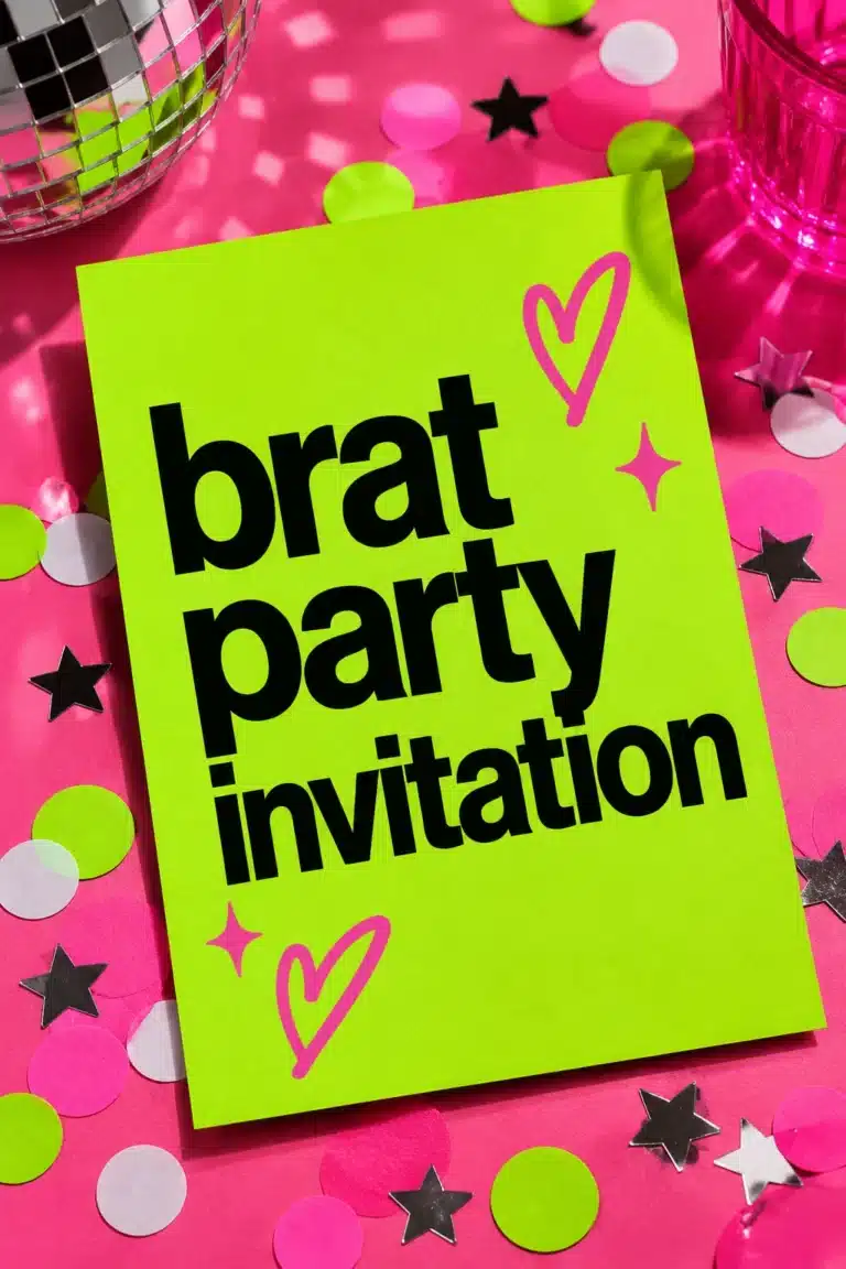
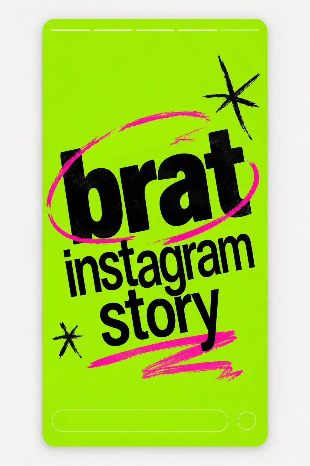
A Brat Instagram Story is a vertical 9:16 graphic that borrows the high-contrast, flat-color, bold-type energy associated with Brat-inspired fan design. It can be a single word on a lime background, a short announcement, a playlist card, a birthday message, or a visual frame around a photo or video.
The best stories are not overloaded. A viewer may see the design for only a moment before tapping away, so the graphic should communicate one thought. The story can be minimal and still feel intentional when the type scale, contrast, and placement are right.
Instagram Story size and ratio
Use a 1080 × 1920 pixel canvas for a full-screen Instagram Story. That is a 9:16 ratio and gives you a clean starting point for most modern phones. Instagram may display Stories on devices with slightly different screen shapes, so keep essential copy away from the very top and bottom.
| Story element | Recommended size | Why it matters |
|---|---|---|
| Full Story canvas | 1080 × 1920 | Full-screen 9:16 layout |
| Main text safe area | Center region | Avoids profile and reply UI |
| Story highlight cover | 1080 × 1080 | Square crop, centered subject |
| Feed teaser crop | 1080 × 1350 | Useful if you also post it to the feed |
The generator’s IG/TikTok Story preset is a convenient starting point. If you need an exact layout, choose a custom 1080 × 1920 canvas.
How to make a Brat-style Story
1. Decide the one message
Start by describing what the viewer should remember. “new playlist,” “out tonight,” “birthday brat,” and “save this” are examples of compact messages. If you need to include a date or call to action, make the headline short and place the supporting detail on a second line.
Avoid writing a paragraph directly onto the graphic. Use Instagram’s native text layer or a second Story frame for extra detail. One clean frame often performs better visually than one crowded frame attempting to answer every question.
2. Open a vertical preset
Open the Brat Generator and choose the IG/TikTok Story size. The tool renders the canvas in your browser and lets you adjust the background, text color, font size, blur, and alignment. Because nothing is uploaded for processing, you can experiment quickly on a phone or desktop.
3. Choose the background first
Classic Brat Green, commonly represented as #8ACE00, is the obvious starting point, but the wider palette gives you room to build a series. Use green for announcements, hot pink for celebratory frames, black for high-drama statements, white for a clean information card, and purple or cyan for variations.
Keep the background flat unless the design genuinely needs texture. Flat color makes text easier to scan and leaves room for Instagram’s interface. If you add blur, use it carefully: too much softness can make short words look fuzzy at the exact size where they need to be crisp.
4. Place text in the safe zone
The top of a Story may show the account avatar, username, progress bars, and navigation controls. The bottom can contain the reply field, link sticker, or other action controls. Keep the headline in the middle section and leave a comfortable margin on every side.
For a story with a link or sticker, design the background first and add the interactive sticker in Instagram afterward. This gives you control over its final position and avoids hiding an important word beneath it. If you are promoting an event, keep the date and location together in the center rather than separating them near the edges.
5. Use a short, readable headline
Large lowercase type is a strong fit for the aesthetic, but it should not be so oversized that the letters touch the border. One to four words is a useful rule. For longer phrases, create two lines and use a slightly smaller size. Test the design on a real phone, not only in a large browser preview.
High contrast is essential. Black on green, black on white, or white on black are dependable combinations. Pink, cyan, and yellow can be expressive, but check whether the text remains legible on a smaller screen and in bright daylight.
Story ideas for creators and brands
Creators can use a Brat Story for a new video teaser, a behind-the-scenes note, a poll prompt, or a music recommendation. A fashion account can make a “look of the day” card with the outfit details added as native Instagram text. A fan page can create a bold reaction frame without pretending to be an official artist account.
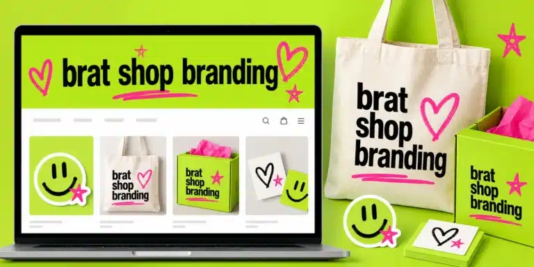
Small businesses can use the style for a limited-time announcement, an event countdown, or a colorful product callout. If the business needs a logo, place it in a quiet corner but keep the main message dominant. The Brat-inspired look is strongest when the design still feels like a graphic rather than a conventional advertisement.
Build a reusable Story system
Create three or four background colors and assign each one a purpose. For example, green can mean a regular post, pink can mean an event, black can mean an opinion, and white can mean a practical update. Reusing the same palette helps followers recognize your Stories while the headline changes from frame to frame.
Keep a consistent text alignment too. Center alignment feels like cover art; left alignment feels more editorial; right alignment can work for a photo-led frame. Pick one default and break the pattern only when the content needs it.
Common mistakes
The biggest mistake is designing for a square feed post and letting Instagram crop it into a Story. A square composition usually leaves the headline too low or too large. Another mistake is placing a headline beneath the profile controls or above the reply area. Keep the edges calm.
Do not use five fonts, several gradients, and a paragraph of copy. The point of this visual direction is fast recognition. Do not sacrifice contrast for an unusual color pairing, and do not make every story identical if the audience needs to distinguish a promotion from a casual update.
Final checklist
Use 1080 × 1920, keep the main message in the center, leave top and bottom space for Instagram controls, choose a high-contrast palette, keep the copy short, and test the Story on a phone before publishing. You can start from the site’s IG/TikTok Story preset, then add Instagram’s native stickers, links, polls, or mentions after exporting.
For more formats, connect this guide to the site’s Brat text generator, Brat text generator, and Brat-style Pinterest guide. Those links create a useful internal path from social Story design to related creation tools.
FAQ
What size is a Brat Instagram Story?
Use 1080 × 1920 pixels with a 9:16 aspect ratio.
Where should the text go?
Place important text in the middle portion of the frame, away from the top profile controls and bottom reply or sticker area.
Can I use the same design for TikTok?
Yes. A 1080 × 1920 vertical design is a practical shared starting point, although each platform’s interface can cover different areas.
Can I add a link or poll to the generated image?
Yes. Export the background from the generator, upload it to Instagram, and add interactive stickers natively so they remain tappable.
Frequently asked questions
What size is an Instagram story?
Stories use a 9:16 ratio, commonly 1080 by 1920 pixels.
Where is the safe area?
Keep important text away from the top and bottom, where the profile name and reply bar appear.
Can I reuse a feed post as a story?
Resize or re-export it for 9:16 so text is not cropped.
Brat Generator is an independent tool and is not affiliated with, endorsed by, or sponsored by Charli XCX, her record label, or any related brand. Any album or trademark names are mentioned only to describe a visual style.