Brat Podcast Cover Art: How to Design a Memorable Square Podcast Graphic
Podcast cover art has to work in several places at once. It may appear as a tiny square in a listening app, a social preview, a website card, a newsletter image, or a video thumbnail. A Brat-inspired design is a natural fit because its flat color and bold type remain recognizable when reduced. The catch is that minimal design leaves nowhere for weak hierarchy to hide. Every word, color, and margin matters.
This guide explains how to plan a Brat podcast cover, choose a canvas, write a short title, create the main graphic with the Brat Generator, and prepare supporting versions for social promotion. It is written for independent podcasters, fan communities, culture newsletters, and creators who want distinctive cover art without a complicated workflow.
What is Brat-style podcast cover art?
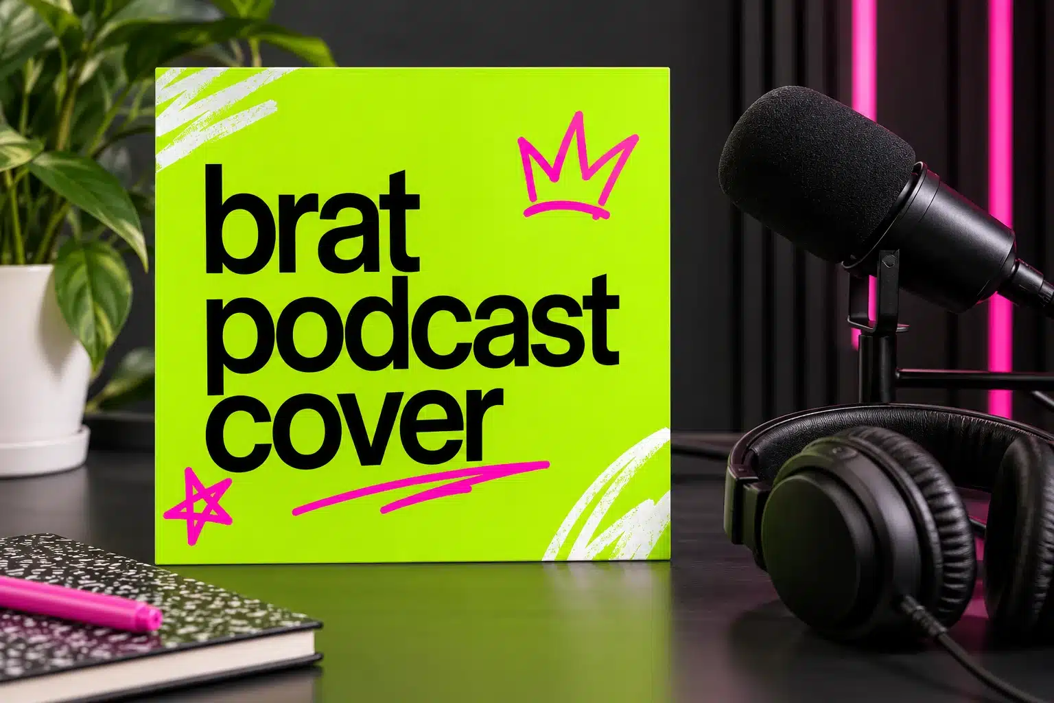
Brat-style podcast cover art is square artwork that uses a saturated flat background, bold lowercase typography, high contrast, and a deliberately direct layout. The design direction is inspired by a broader pop-culture aesthetic, but the podcast artwork should be original. Do not copy official album artwork, use protected logos, or suggest an endorsement that does not exist.
The style can communicate different podcast moods. Lime green and black feel loud and immediate. Black and white feel sharper and more editorial. Hot pink or purple can make a conversational show feel playful. The same structure can support music commentary, fashion, internet culture, personal essays, interviews, and community discussions.
Podcast cover size and technical basics
Podcast platforms generally expect square artwork, and a large square master gives you room for reuse. A 3000 × 3000 pixel master is a practical professional target when your artwork is created from scratch, while a 1400 × 1400 or 2000 × 2000 version can work for a lightweight workflow. Always check the requirements of the directory where you plan to submit the show.
Keep the design square from the beginning. Do not stretch a rectangular social graphic into a square after the text has been placed. If you need a Story, feed post, or video thumbnail later, create a new crop from the square master so the hierarchy stays intentional.
Plan the title before opening a design tool
Write the show name exactly as it should appear. Then decide whether the cover needs a subtitle. A podcast title should be readable without zooming, especially when the artwork is displayed as a small thumbnail. If the name is long, use a short abbreviation or a compact line break rather than shrinking the letters to fit.
You can add a host name, season label, or category, but these are secondary. The cover should not become a list of metadata. The podcast title is the promise; the description and episode title can explain the rest.
How to create Brat podcast cover art
1. Choose the background color
Start with a flat field. Classic Brat Green is commonly represented by #8ACE00, but there is no requirement to use it every time. Test black, white, pink, purple, blue, cyan, yellow, and gold. Keep the first version to one background and one text color. Add an accent only after the title reads clearly.
Contrast is more important than novelty. Black on bright green is usually clear. White on black is reliable. Pink on a bright green background may look exciting but can lose clarity at a small size. Preview the design at the approximate size where listeners will see it.
2. Set the main typography
Use a bold, clean treatment and keep the title in lowercase if that suits the concept. Center alignment feels like cover art; left alignment can give the show a magazine-like character. Do not use a decorative typeface that becomes difficult to recognize when the cover is reduced.
Open the Brat Generator, choose a square canvas, and enter the show name. Adjust the font size until it fills the composition confidently without touching the edges. The generator is especially useful for testing multiple color and text variations quickly.
3. Create a visual anchor
The title can be the visual anchor, but a small mark may help the cover feel more ownable. Use an original symbol, a simple star, a line, a hand-drawn shape, or a small object related to the show. Keep it secondary. A podcast cover that needs five icons to explain itself probably has a positioning problem rather than an illustration problem.
If the show has a host or guest-led format, a portrait can work, but it is not required. A flat typographic cover is often more memorable than a generic microphone photograph. If you do use a photo, keep the text on a quiet area and check the contrast across the entire crop.
Design for the thumbnail first
The most important test is the tiny thumbnail. Shrink the artwork to the size it may appear in a directory or mobile list. Can you read the show name? Is the color pairing still obvious? Does the cover look different from a blank color tile? If the title disappears, remove secondary elements and enlarge the core words.
A good thumbnail has one entry point. The eye should land on the podcast name before it explores the accent mark or background texture. Keep margins generous so the artwork still feels balanced when platforms add rounded corners or crop previews.
Create a full podcast visual system
The cover is the foundation, not the entire brand. Make supporting templates that reuse the same colors and title treatment. You can create episode cards with a short episode phrase, quote graphics for social media, a square guest announcement, and a vertical Story version. Link internally to the site’s Brat text generator when you want longer phrases, and to the Brat text generator when readers want a music-like square composition.
Keep the episode template simpler than the show cover. The series name can stay small while the episode topic becomes the main phrase. Use a consistent corner or color rule so listeners know the card belongs to the same podcast.
Export and file organization
Keep a high-resolution square master and export smaller copies for the website, social posts, and episode cards. Use a modern compressed format for web images when your publishing system supports it. A filename such as brat-podcast-cover-art-guide.webp is clearer than image-final-3.png.
Save a version without the show title if you want to reuse the background as a promotional template. Save a version with live text in your design file so future seasons can be updated without rebuilding the layout from zero.
Common mistakes
The biggest mistake is using too much text. Podcast artwork is not a press release. Another mistake is making the background so textured that the title loses contrast. Avoid tiny host names, weak margins, and a layout that looks good only when viewed at full size.
Do not use an artist’s official logo or album artwork as your own podcast identity. Use an original color and type system, and be clear if the show is fan-created or commentary rather than official.
Final checklist
Use a square canvas, make the title dominant, choose high contrast, test the thumbnail at small size, keep secondary details limited, create reusable episode templates, add descriptive image metadata, and verify the submission requirements of your podcast directory. Start with the free Brat Generator to explore the main typographic direction.
Frequently asked questions
What size should podcast cover art be?
A large square master such as 3000 × 3000 pixels is a practical professional starting point. Check the exact directory requirements before submission.
Should a podcast cover include a microphone?
No. A microphone is optional. A strong title, color system, and readable hierarchy are often more distinctive.
Can I use Brat Green for a podcast brand?
Yes, you can use a color value in an original design. Avoid copying protected artwork or suggesting official affiliation.
Can the Brat Generator make podcast cover art?
Yes. Choose a square canvas, enter a short title, adjust the colors and typography, and export the result for further assembly if needed.
Brat Generator is an independent tool and is not affiliated with, endorsed by, or sponsored by Charli XCX, her record label, or any related brand. Any album or trademark names are mentioned only to describe a visual style.