How to Make Brat App Icons for Your iPhone Home Screen
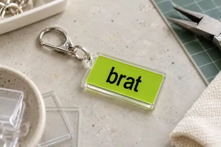
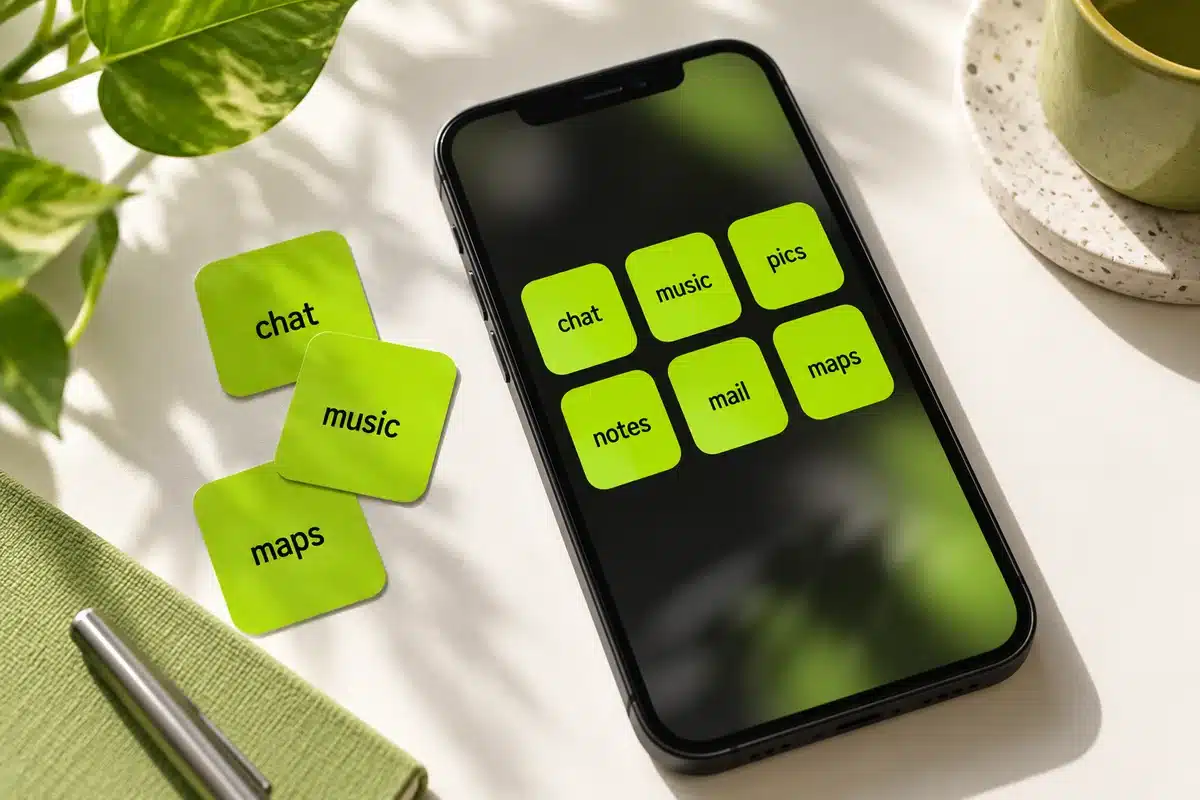
Brat app icons turn everyday shortcuts into small lime-green text tiles. To make them, create a square image for each app, save the images, then use Apple Shortcuts to add custom launchers to your iPhone Home Screen. Start with a few favorite apps so you can check readability before rebuilding a whole page.
You can design the artwork in our brat generator using short lowercase labels, a flat background, and consistent spacing. The generator makes the image; Apple Shortcuts connects that image to an installed app. Keeping those two jobs separate makes the process much easier to troubleshoot.
Decide what your icon set should do
A useful custom Home Screen should still help you find things quickly. Before designing anything, write down six apps you open every day. Give each one a label you recognize immediately: “chat,” “music,” “pics,” “notes,” “mail,” or “maps.” These are suggested design labels, not an installable icon pack.
Personal jokes can work, but consider whether you will remember them when you are in a hurry. Two apps labeled “stuff” and “things” might look amusing together and become frustrating tomorrow. If two apps serve similar purposes, choose labels that distinguish their actual roles, such as “work” and “friends.”
Start with one row or one page. A small set exposes spacing problems early and gives you time to decide whether text icons suit your routine. You can keep original icons elsewhere while experimenting.
Choose a consistent visual style
Use one background and one text color
Black lettering on a lime-green background gives the clearest connection to the aesthetic. The site's green preset uses #8ACE00. You can also use black tiles with white lettering if you prefer a calmer screen. Keep the same colors throughout the first set so individual labels remain the main difference.
Avoid assigning a different bright color to every app before checking the complete grid. The collection can become harder to scan when color, word length, and text size all change at once. One accent tile can identify your most important app without making the whole screen busy.
Make the lettering readable at icon size
A word that looks clear in a large preview can disappear when reduced to a small tile. Use short labels and restrained blur. For this application, crisp recognition matters more than reproducing every detail of album artwork.
Leave room around all four sides. As a starting design choice, keep the lettering within the middle two-thirds of the square, then inspect the result on your phone. This is a practical margin recommendation, not an Apple submission requirement. Rounded corners should never touch the first or last letter.
Create and save your icon artwork
Open the generator and select its square canvas preset. The 1200 × 1200 option provides a convenient source image; you do not need to create an App Store icon or meet developer asset specifications for this personal shortcut workflow.
Enter your first label, select the background and text colors, and center the word horizontally and vertically. Adjust the font size until the label reads comfortably with space around it. Save a PNG rather than taking a screenshot, which can accidentally include browser controls or unwanted margins.
Repeat for the remaining labels while preserving the same canvas and colors. Auto-fit can make a short word appear larger than a long one. If that looks uneven, use the font-size control to bring their visual weight closer together. Consistency is more useful than filling every available pixel.
Name the files clearly, for example “brat-chat-icon.png” and “brat-music-icon.png.” Keep them together in Files or Photos. If downloading on your phone is unfamiliar, our mobile Brat generator guide explains the broader mobile workflow.
Add the images through Apple Shortcuts
Apple documents both creating a custom shortcut and adding it to the Home Screen with a custom image. Menu placement can vary with your software version, so follow the corresponding guide if a control looks different.
- Open Shortcuts and create a new shortcut.
- Add the Open App action and choose the installed app you want to launch.
- Run the shortcut once to confirm that it opens the correct app.
- Open the shortcut's details or menu and choose Add to Home Screen.
- Tap the icon preview and select your saved image using Choose Photo or Choose File.
- Enter a clear Home Screen name, then tap Add.
Repeat this process for each app. The resulting tile is a launcher that runs a shortcut. It does not replace the app's identity throughout iOS or change the artwork inside the app.
Arrange a Home Screen you can actually use
Place your most frequently used launchers where your thumb naturally reaches. Keep related tasks together: messaging and email in one row, music and photos in another. If you already know where an app sits, preserve that position while changing its appearance.
Pair the icons with a simple background. A wallpaper covered in large lettering can compete with six small words on top of it. Our Brat wallpaper guide offers a separate starting point for making a matching background.
Try the page during an ordinary day before expanding it. Open a message, find a saved photo, and start your usual playlist. If you repeatedly tap the wrong tile, change its label or position. A successful theme should make your phone feel personal without turning basic navigation into a memory test.
Fix common icon problems
The word is cropped or too small
Return to the original square artwork. Shorten the label, reduce the font size, or add more breathing room. Re-export the image and assign that revised file to the shortcut. Enlarging a tiny screenshot usually preserves its original softness rather than restoring clear edges.
Preview the full grid after each change. The ideal size for “mail” may overwhelm “photography,” which is a good reason to choose “pics.” Shorter language is often the cleanest design fix.
The shortcut launches the wrong app
Open its editor and inspect the app selected in Open App. The picture and Home Screen label do not determine the destination. Duplicating shortcuts saves setup time, but you must change the selected app as well as the artwork.
Keep a simple checklist while building a larger set. Mark each shortcut only after you have opened it successfully from the Home Screen. This catches mismatches before several identical green tiles make them difficult to spot.
The custom tile behaves differently
Treat the launcher as a shortcut, not a complete replacement for every native icon feature. If notification badges, quick actions, or another behavior matter to your routine, test them before moving the original icon. Retain the original wherever it remains useful.
Avoid deleting an installed app just to tidy the theme. Removing a launcher and deleting its destination app are different actions. Read the confirmation wording carefully whenever you reorganize your screen.
Keep a reusable source set
Save the PNG originals and a short note containing the color values and your preferred text settings. When you install another app, those details let you extend the set without guessing which green or font size you used.
Keep a second folder for experiments so a temporary pink version does not overwrite the finished green set. If you share your designs with friends, include the images and explain that each person still needs to connect them to their own apps. The artwork alone cannot configure someone else's phone.
Before sharing a screenshot of your finished Home Screen, check widgets, notification previews, and visible app names for anything personal. Crop the example to the themed area if necessary. A useful showcase includes the complete grid at normal size, because that is where people can judge readability. Keep the individual PNG files separate from the screenshot; a preview of the whole phone is not a substitute for the original artwork needed during installation.
Frequently asked questions
Can I make Brat app icons for free
You can create the artwork with the site's free generator and use Apple's Shortcuts workflow. This guide does not require buying an icon pack. Any separate app you choose may have its own terms or pricing.
Do custom icons replace the original app icons
They create additional Home Screen launchers with your chosen artwork. The original app remains installed, and its appearance elsewhere is not automatically changed. Test the shortcut before reorganizing your original icons.
What image format should I use
PNG is a sensible starting format for these flat text graphics. Save a square original with generous margins, select that image in Shortcuts, and inspect the final tile on your actual Home Screen.
Should every icon say brat
Using a different short label for each app makes the page easier to navigate. You can keep the Brat style through matching colors and lettering while letting the words communicate each app's purpose.
Can I use these images on Android
The artwork is reusable, but installation depends on your Android device and launcher. Apple's Shortcuts steps do not apply. Check your launcher's custom-icon settings before making a large set of images.
What size is an iPhone app icon?
Apple publishes current icon sizes in its Human Interface Guidelines; a 1024 by 1024 pixel master is commonly used.
Can I change a home-screen icon?
Yes, using the Shortcuts app on iPhone; check Apple’s current instructions.
Should icons have text?
Keep text to one or two letters so it stays readable at small sizes.
Brat Generator is an independent tool and is not affiliated with, endorsed by, or sponsored by Charli XCX, her record label, or any related brand. Any album or trademark names are mentioned only to describe a visual style.