How to Make a Brat-Style Logo or Wordmark
How to Make a Brat-Style Logo or Wordmark
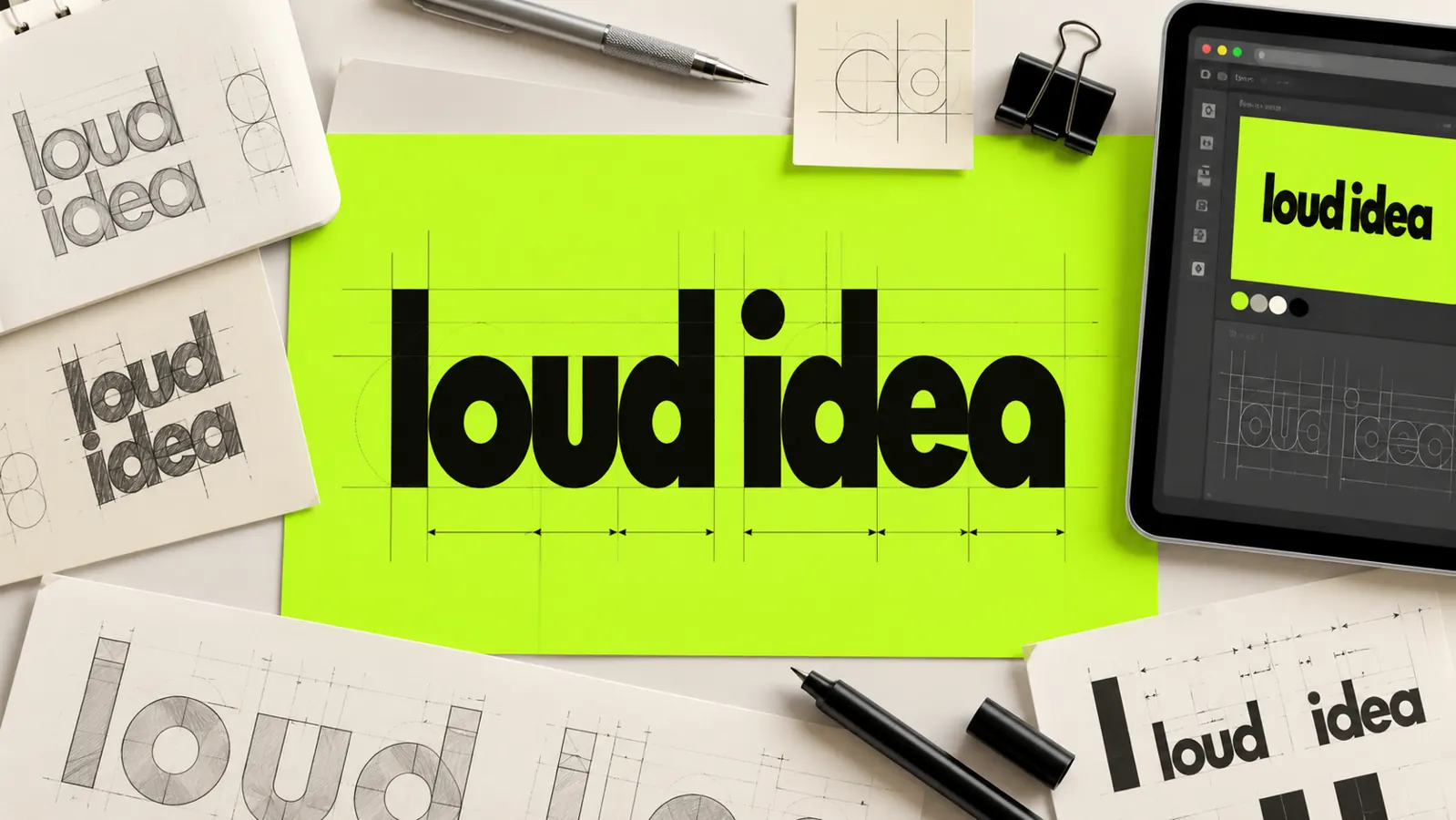
A Brat-style wordmark is made by reducing a name to strong lowercase text, controlling its spacing, and placing it in a simple high-contrast layout. The result should identify your own project clearly without copying an official logo or implying an affiliation.
You can begin with the free Brat text generator and refine the export in a basic design editor. The important work happens before the effects: choosing an original name, establishing readable letter shapes, and testing the mark wherever people will see it.
Understand what you are making
A wordmark is a logo built mainly from a name. It does not need a mascot, symbol, or detailed illustration.
This format suits a playlist, event series, student project, creative profile, podcast segment, or small campaign. It can also act as a temporary visual identity for a social post series.
An inspired wordmark is not an official logo. Do not use an artist’s name, official campaign title, album artwork, or language that suggests approval or partnership.
If the mark represents a business, check whether the name conflicts with an existing trademark in the markets where you operate. A visual generator does not provide legal clearance.
Choose a distinctive name
Start with a short name that belongs to your project. One or two words are usually easier to recognize at small sizes.
Read the name aloud and look at it in lowercase. Some names sound memorable but create an awkward shape when typeset. Others become more distinctive because of repeated letters or a strong ending.
Avoid adding “official” unless the claim is accurate and appropriate. Also avoid names that can confuse viewers about who created or sponsors the project.
Create three wording options before choosing one. A comparison prevents you from investing in the first idea simply because it is already on the canvas.
Generate the first text version
Enter the selected name into the generator. Export a clean version before experimenting with extra labels or textures.
Lowercase text supports a casual and direct visual tone. However, the name must still be readable. If a particular letter is unclear, test a slightly different type treatment or add more spacing.
Keep the original export untouched. Duplicate it for experiments so you can compare every revision with the simple baseline.
The existing Brat font explanation can help you understand the general typographic character. Use that understanding to make an original application rather than tracing a protected logo.
Refine spacing before adding color
Letter spacing changes how a wordmark feels. Tight spacing can look energetic, while wider spacing can feel calmer and more deliberate.
Zoom in and examine the gaps between neighboring letters. Equal numeric spacing does not always look visually equal because narrow and round letters occupy different shapes.
Adjust only the pairs that appear crowded or disconnected. This process is called optical spacing, but you do not need specialist software to apply the principle.
Also check the empty space around the full word. A wordmark needs clear space so nearby photos, borders, and interface elements do not compete with it.
Choose a simple color system
Begin in black and white. If the wordmark fails without color, color is unlikely to solve its underlying shape or spacing problem.
After the monochrome version works, add one primary color and one supporting neutral. A bright yellow-green can communicate the familiar energy, but it should be treated as your chosen design color rather than an “official” specification.
Test the mark in three combinations: dark on light, light on dark, and one-color on transparent. These versions cover most practical placements.
Record color values in your own project notes. The Brat-style brand kit guide explains how to keep colors, typography, and usage rules consistent across several assets.
Build horizontal and compact versions
A single layout rarely fits every platform. Prepare at least a horizontal version and a compact version.
The horizontal wordmark suits website headers, video end cards, and wide banners. The compact version can be a stacked name or an initial-based variation for profile images.
Do not squeeze the horizontal mark into a square. Rearrange it intentionally and preserve the original letter proportions.
If the name is one word, a compact version may simply use a tighter crop. If it is two words, test one word per line while keeping alignment consistent.
Add a descriptor only when needed
A descriptor explains what the project is, such as “studio,” “playlist,” “club,” or “weekly edit.” It should remain secondary to the name.
Use a smaller size and additional spacing to separate the descriptor from the main wordmark. If both lines compete equally, the viewer will not know what to remember.
Avoid unsupported claims in the descriptor. Words such as “certified,” “official,” “partner,” or “original” can create a false impression when they are not factually justified.
Remove the descriptor in small placements. A profile icon must remain clear even when the supporting line disappears.
Test the wordmark at real sizes
Large canvas previews hide weaknesses. Reduce the mark to the approximate size of a phone profile image, navigation header, and small product thumbnail.
At each size, ask three questions: Can I read the name? Do any letters merge? Does the mark still feel balanced?
Print a small black-and-white version if the mark will appear on physical material. A screen can make thin edges and subtle contrast look stronger than they print.
For an online shop, test the wordmark beside real listing images. Our Etsy shop branding guide provides a broader workflow for banners, icons, and listing consistency.
Create clear-space and minimum-size rules
Clear space is the empty area that must surround the mark. A simple rule is to use the height of one lowercase letter as the minimum margin on every side.
The exact measurement matters less than consistent application. Document the rule with a small diagram or written note.
Set a minimum digital width after testing the actual mark. Below that width, use the compact version or plain text instead of allowing it to become unreadable.
These rules turn a one-off graphic into a repeatable identity. They also help collaborators use the mark without guessing.
Export the correct files
Export a transparent PNG for common digital use. Keep enough resolution for the largest expected placement.
Save a JPG preview on a solid background for easy sharing. JPG does not support transparency, so it is not the master logo file.
If your editor supports vector export, save an SVG or PDF version after checking that the lettering remains accurate. Vector files scale without becoming pixelated, but unsupported effects may change during export.
Use descriptive names such as project-name-wordmark-dark.png, project-name-wordmark-light.png, and project-name-wordmark-compact.png.
Keep the editable source file and note which type assets were used. This record makes later revisions and licensing checks easier.
Protect readability and accessibility
Maintain strong contrast between the wordmark and its background. A trendy color combination is not useful if viewers cannot identify the name.
Do not use the wordmark as the only way to communicate important information. Include the project name as live text on web pages and in account profiles.
Add concise alternative text when the mark is an informative image. If the same name appears immediately beside it as text, an empty alt attribute may be appropriate for a purely decorative implementation.
Avoid rapid animation, flashing color changes, or distortions that make the letters difficult to follow.
Run a non-affiliation check
Review the final design as if you were seeing it for the first time. Could a viewer reasonably mistake it for official merchandise, an artist account, or an endorsed campaign?
If the answer may be yes, change the name, wording, or composition. Add a clear independent-project note where context requires one.
Do not include official artwork, celebrity photographs, song lyrics, or copied promotional phrases. Original wording and original assets make the identity more useful and reduce avoidable risk.
For public-facing commercial work, obtain professional legal advice when rights or trademark questions are material.
Common wordmark mistakes
Copying instead of interpreting
Recreating an exact protected logo produces confusion and offers little originality. Use the broad qualities—direct text, bold contrast, restrained layout—to build your own result.
Adding too many effects
Multiple shadows, outlines, textures, and stickers weaken a simple wordmark. Keep one purposeful treatment and remove anything that does not improve recognition.
Designing only at full size
A mark that looks impressive on a large canvas may fail as a small icon. Test realistic sizes throughout the process.
Ignoring background versions
One green version cannot work everywhere. Prepare light, dark, and transparent alternatives before you need them.
Losing the source file
A flattened image is difficult to revise. Store the editable version with its color and spacing notes.
A practical approval checklist
Before using the wordmark, confirm that:
- The name is original to your project.
- The lettering is readable at small sizes.
- Spacing looks balanced rather than mechanically equal.
- Light and dark versions both work.
- The compact version keeps correct proportions.
- No official artwork, lyrics, or misleading claims appear.
- Export names and source files are organized.
- The surrounding page also states the project name as text.
Create the first version
Choose your original name, generate a clean lowercase text treatment, and solve spacing before adding visual effects. Then test the mark at small sizes and export light, dark, and compact versions.
A useful wordmark is clear, repeatable, and unmistakably connected to your project—not to someone else’s official identity.
Frequently asked questions
Is a wordmark the same as a logo?
A wordmark is a type of logo built primarily from a written name. It can serve as the main identity without a separate symbol.
Should a Brat-style wordmark always be lowercase?
No. Lowercase supports the familiar informal tone, but readability and the character of your own name should guide the decision.
Can I use the official logo for my project?
Using an official logo can imply ownership or endorsement. Create original wording and a distinct composition instead, especially for public or commercial use.
Which file should I upload to a website?
A transparent PNG is broadly compatible. Use SVG when your site supports it and the exported vector has been checked carefully.
How many colors should the logo use?
One primary color plus a neutral is enough for most simple wordmarks. Always keep a one-color version for difficult backgrounds and printing.